Sunday, April 24, 2011

Part 6 Predicting regional and global peak oil and total recoverable oil.


"Globally, we find more (oil) all the time, but we haven't actually found as much as we've used in a given year since 1985," said Maj. John Sheahan, another member of the research team.

"From the long (term) view, it's guaranteed that something else will take over (as an energy source), we just don't know what or when.  Nobody has yet come up with the solution (so) that we can (continue to) do the things we do now and have done for decades.

"So it is possible that the timeline is against us."

Yes Major, I do believe that the time line is against you, and you probably know this for a fact.  What is not guaranteed is that there will ever be a replacement which has the energy density and transportability of petroleum.  This news story is yet another example of what we have being starting to see with increased frequency: military and government study groups and companies all talk openly about the problems that lay directly ahead, while the public and politicians remain largely asleep—or at least silent.

Part 2 and part 3 of this series presented a regional analysis of global petroleum production and consumption trends for the Middle East (ME), Former Soviet Union (FS), Africa (AF), South America (SA), Asia-Pacific (AP), Europe (EU) and North America (NA).   Part 4 used this data to predict how the global petroleum export pool will likely decline to zero in about 2030-2035. Part 5 used the data to predict what petroleum consumption will look like for each of these regions as global net-export pool declines to zero. 

Here in part 6, I analyze the same data to predict peak oil and total recoverable petroleum (Q; sometimes referred to as URR, ultimate recoverable reserves) for these seven regions, and for the world. 

I also briefly compare my predictions to predictions made by others, and, present a fantasy consumption scenario for North America.

A simple analysis of global petroleum production

Figure 19 shows the reported global petroleum production and consumption data from the BP statistic review and the best fits of single Hubbert Equations to these data sets:


The best fit parameters from these fits are summarized in Table 9 below:


Table 9: summary of best fit parameter for world production and consumption


Qo (bbs)
Q (bbs)
a (yr-1)
Production 1965-2009
611
4135
0.030
Consumption 1965-2009
528
4073
0.032


If properly accounted for, global annual consumption must equal global annual production.  But, as I pointed out in Part 5, for the past 30 years, the BP data base has systematically reported annual world production rates that are lower than the annual consumption rate, and before that, the opposite systematic difference existed (reported production always greater than consumption).  If you look at Figure 19 carefully, comparing the open red and blue circles for each year, you can see this trend, which as I mentioned before is not explained by BP.  The systematic difference explains why the best fit parameters are slightly different for production and consumption data. 

The best fits to both data sets, however, are quite close, and basically tell the same story: world production rates are increasing at about 3 percent per year (“a” = 0.03 yr-1), the total recoverable petroleum (Q) equals about 4 trillion barrels and the peak production rate of 31-32 billion barrels per year (bbs/yr) will not occur until 2023.  These broad curves suggest that global production could plateau at or slightly above present levels for another 20 years.   

This suggestion of a broad, slowly declining production curve is akin to what I have referred to in past as the rosy peak oil scenario.  The rosy peak oil view admits that oil production will peak and decline, but the decline will play out over decades.  This implies that there will be a good amount of time (e.g., decades) to adapt our transportation network, food production infra-structure, manufacturing sector, etc... to a world with gradually declining petroleum resources.   

My 7-region analysis and its composite sum suggests a quite a different scenario than this simple analysis.

Seven region analysis of global petroleum production trends

As explained previously in parts 1-3, because the production curves for the seven regions (shown in Figures 1-7, in part 2 and part 3) are not described very well by a single logistic curve, I fit separate multiple Hubbert equations to different time spans of the production data for each of the seven regions. 

If the separate Hubbert Equations were completely separated in time (due to having been fit to well-separated peaks in reported production at different times) then the best-fit Q values from these separate fit would add up to the total recoverable oil.  But, because this is not the case, and there is substantial peak overlap, the best-fit Q values from these separate fits do not equal total recoverable oil for the region.

However, I can use the best fit parameters from these separate fits to generate a single simulated production curve, and then integrate total area under the simulated curve to calculate an overall Q for the region.   

I used the values of the Hubbert Equation parameters, Qo, Q and "a," obtained from my best-fits to the production data, to produce such a simulated curve with the simulated curves interpolated far into the past and future.  Then I added up (i.e., digitally integrated) the annual dP/dt values to estimate the value of Q∞, the total recoverable oil for that region.  To perform the digital integration, I interpolated out to dP/dt values of 0.1 bbs/yr in future and past time directions, and summed the cumulative dP/dt values in between these two 0.1 bbs/yr values (somewhat variable from region to region, but generally about the 1950s to 2050; NA was an exception: 1938-2143).

Table 10 shows the estimates of Q for each of the seven regions using this method.  Table 10 also presents my estimate of how much petroleum was used up to 2010 (i.e., Q2010, the area under the curve up to 2010) and what percentage this is of the total area (i.e., what percentage has been produced, or the percentage of depletion, by 2010).


Table 10: Summaries of best fit parameter for regional total recoverable petroleum


Q (bbs)
Q2010 (bbs)
% depletion 2010
Middle East
517
325
63
North America
470
254
55
Former Soviet Union
270
180
67
Asia-Pacific
186
95
51
South America
168
100
59
Africa
137
117
85
Europe
75
65
87


I presented the seven regions in Table 10 in order of decreasing Q.  All seven of the regions by 2010, have less than 50% of their total recoverable petroleum remaining and some have produced substantially more than half.  EU and AF, for instance, have already used more that 85% of their recoverable petroleum.  For EU, this is likely because the North Sea oil reserves have been on the decline-side of the production curve for several years.  For AF, this is because of the recent sharp increase in production rates and the subsequent sharp transition to the decline-side of the production curve at the same rate.  This is why in part 6, I suggested that AF and EU will be in serious trouble when the global export pool hits zero in 2030-35. 

Peak oil aficionados will understand that “peak oil” refers to the all time maximum in the production rate (dP/dt).  “Peak oil” is often incorrectly defined as the point where half the oil has been pumped out of the ground, or, “produced.”  The time when half of the recoverable oil has been produced (i.e., ½ Q∞), and the time of maximum production rate (“peak oil”), only coincide exactly when the time course in production rate follows a single Hubbert Equation.  That is, “peak oil” and ½ Q∞ only coincide in time when a logistic curve accurately describes the entire time course of production of the well for whatever is area is being considered—the well, the group of wells, or all the wells in a country or region, or the world.  This rarely, if ever happens in practice.  When this doesn’t happen, “peak oil” and ½ Q∞ do not necessarily occur in the same year. 

The best fits of Hubbert Equations to the production data for the seven regions, and the digital integration of the extrapolated best fit simulated curves for each region, allowed me to estimate both the year of peak production rate (i.e., the year of “peak oil”) and the year of ½ Q∞, both of which are summarized in Table 11 below.


Table 11: Summaries of regional years of Peak Oil and 50% depletion


Peak Oil
½ Q∞
Middle East
2007
2002-2003
North America
2005
1985
Former Soviet Union
2012
1999-200
Asia-Pacific
2006
2009-2010
South America
2008
2003-2004
Africa
2007
1994-1995
Europe
1999
1997


Global petroleum production trends from the cumulative sum of the 7-region analysis

Figure 20 shows the predicted global production rate (the blue curve) as the composite sum of the simulated curves from the best fits of the Hubbert Equations to the production rate data for each of the seven regions.  For reference, I also present the reported global production data (open blue circles), which is the sum of the reported production data for the seven regions. 


The composite sum of the prediction curves for the seven regions is in very good agreement with the reported global production rates from 1965-2009. 

Even though the 7-region sum is the sum of separate best fits to seven different production curves, the composite curve shows a nearly linear decline-side slope from 2010 to 2030 of about 0.78 bbs/yr per year.  That is, the total global production rate is declining by 0.78 bbs/yr (~2 mbd) every year for 20 years, before the decline starts to tail off to a lower rate. 

Next, I estimated the global total recoverable petroleum, or, ultimately recoverable reserve (Q) by taking the sum of the regional Q values reported in Table 9.  The total amount of global petroleum recovered up to 2010 (Q2010) was estimated from the composite curve.  The composite curve for the seven regions was also used to estimate the year of global peak oil and the year of 50% depletion.  The results are summarized in Table 12. 


Table 12: Global production parameters from the sum of the 7-region analysis

Q
Q2010
% depletion 2010
Peak Oil
½ Q
1823 bbs
1136 bbs
62
2007
2002


Figure 21 compares the 7-region composite curve (solid blue line), the single Hubbert Equation best-fit (dashed blue line) and the reported total world production data (open circles).  For reference, I also show the net global export rate curve, which was discussed in Part 4 (see Figure 8).


The predicted production rate curve based on the 7-region composite curve clearly fits the reported data (open circles) much better than the single Hubbert Equation best fit does.  This makes sense to me because the composite curve actually represents the analysis of seven times more data (i.e.,  fits of multiple Hubbert Equations to each of the 7 region’s reported data) than the single data set (i.e., fitting one Hubbert Equation to the global reported production).  For this reason, I believe that the estimated parameters, Q, 50% depletion, peak oil and ½ Q should be much more accurate than the analogous parameters from the simple Hubbert equation analysis of global petroleum production.

If the curve from the composite sum of the 7-regions is the more accurate of the two predictions, then the future does not look like a rosy peak oil scenario.  Instead of a 20-year period with a plateau in production at or slightly above present rates, we are on the brink of going down the steepest part of the production decline curve.  My composite curve predicts that total world production will go down every year by 0.78 bbs or about 2 mbd, for the next 20 years.  And, instead of living in a world with 4 trillion barrels of total recoverable oil, of which we have only extracted 1.1 trillion barrels, we live in a world with 1.8 barrels, of which we have already extracted 1.1 trillion barrels, leaving only 0.7 trillion barrels left.  Instead reaching a production maximum in about 2023, we have already past peak oil three years ago.  In a world whose economy is driven by, and whose people are fed with, petroleum, the decline in liquid energy wealth is directly ahead, not a decade or so away. 

Despite how bad this sounds, I think that it is even worse for the importing regions of the world, because over this same 20 year period, global net exports will decline from about 13 bbs/yr (35 mbd) to zero.  The importing regions will be facing their own declining production, plus, the declining pool of exportable oil, at the same time.  

The assumption of symmetry
In contrast to a widely discussed theory that world oil production will soon reach a peak and go into sharp decline, a new analysis of the subject by CERA finds that the remaining global oil resource base is actually 3.74 trillion barrels -- three times as large as the 1.2 trillion barrels estimated by the theory’s proponents -- and that the “peak oil” argument is based on faulty analysis which could, if accepted, distort critical policy and investment decisions and cloud the debate over the energy future. ....
Global production will eventually follow an “undulating plateau” for one or more decades before declining slowly.  The global production profile will not be a simple logistic or bell curve postulated by geologist M. King Hubbert, but it will be asymmetrical – with the slope of decline more gradual and not mirroring the rapid rate of increase -- and strongly skewed past the geometric peak. It will be an undulating plateau that may well last for decades.

I don’t know how CERA came up with their prediction, but it sounds a lot like my simple single Hubbert Equation analysis described above—a Q of ~4 trillion and one or more decades of undulating plateau.  I am not going to pay the several hundred dollars they charge for their report, and, I’m not even sure that report would describe their methods.  For the sake of their subscribers, I hope that CERA did do something more elaborate than my simple analysis!  But whatever analsysi they did, they arrive at about the same result as my simple single Hubbert Equation analysis, which I think is far less accurate than my seven-region analysis. 

I am sympathetic , however, to the possibility that global oil production could follow an asymmetrical decline curve, and not the simple logistic curve as assumed by the Hubbert Equation. 

For instance, as I have shown previously, there is good evidence that the production growh and decline side curves for the USA are asymmetric.  In fact, I developed a modified Hubbert Equation to model this very behavior.  As I suggested in my previous analysis of USA production, this asymmetry likely reflects the improved recovery of oil and the development of new petroleum resources such as Alaska (in 70s and 80s) and natural gas liquids (in the 80s, 90s and 00s). 

Because the USA is a major contributor, for NA, there are also asymmetries in the growth versus decline side.  In the present study, however, I choose to model NA’s production profile by fitting multiple Hubbert Equations to different time spans of the data.  Although this doesn’t give me the parameters fca and fcq (fractional change in a and Qº, respectively) provided from the modified Hubbert Equation, the Hubbert Equation fit to the time range 1991-2009 looks very good, and, the predicted production curve is not that different that the curve using the modified Hubbert Equation. 

In the present study, however, many of the other regions (ME, AF, AP, FS, SA) are just approaching, or just at, peak production, and therefore there isn’t enough data on the decline side of the production curve to assess the possibility of asymmetries between the growth-side and decline-side of the production curve. 

I suppose that I could just assume a certain fac and fcq value for the other regions (ME, SA, AP, AF), but in my opinion, there is no factual basis to suggest that new recovery methods or newly discovered oil, will continue to occur global at the same rate as it did over the past 50 years for the USA.  That is, it is not a given that all regions will have asymmetries similar to that of NA.  For instance, consider the last 20 years of data for EU, which includes growth and the decline sides of its production curve.  The growth and decline sides of the production rate looks very symmetric, and, consequently the best-fit of the Hubbert Equation to this range of data looks very tight (see e.g., Figure 4, Part 3, comparing dark blue curve and blue open circles). 

Additionally, there is evidence that the decline side for the other regions of the world may not be long and drawn out like it has been for the USA, and instead more like EU.

For instance, the newer off-shore oil wells appear to be depleting at a much fast rate than older on-land wells (see e.g., Giant oil field decline rates and their influence on world oil production).  Perhaps this explains why EU’s production curve, which is dominated by North Sea off-shore oil production, has such a sharp decline-side. 

For instance, the rate of discovering new wells is much lower than the rate of discovery in the past. (see e.g., Figure 1 Conventional Crude Oil Discovery and Production Rates to 2005 with Projections to 2030, from Colin J. Campbell in The Oil Age: World Oil Production 1859–1950, reproduced in:  Crude Oil Supply - The Oil Age: World Oil Production 1859–1950). 

It follows, therefore that modern methods of recovering of oil from off-shore wells may not lead to a drawn out decline side, and, the potential development of new petroleum resources that would prolong the decline, are greatly reduced because the recent past discovery rate has declined substantially.

Perhaps it is CERA’s hoped for asymmetric shallow decline-side curve, that is the “faulty analysis” and one that is designed to distort “critical policy and investment decisions” and “cloud the debate” over the energy future.  I think that we will find out soon enough.  I'm hoping (but not expecting) that I an wrong, and, that there will be asymmetries on the decline side.

Therefore, in the absence of stronger evidence of growth-side and decline-side asymmetries in the production curve, I have chosen, or the data leaves me no choice but, to model the production data with multiple Hubbert Equations, with their inherent symmetry assumptions. 

Comparison to other predictions

Ultimately recoverable conventional oil resources, which include initial proven and probable reserves from discovered fields, reserves growth and oil that has yet to be found, are estimated at 3.5 trillion barrels. Only a third of this total, or 1.1 trillion barrels, has been produced up to now.
Executive Summary  IEA, World Energy Outlook 2008

The global resource base is 4.82 trillion barrels and likely to grow. CERA’s analysis of global reserves and resources includes both conventional and unconventional oils as well as estimates of both field upgrade potential and yet to find. With some 1.08 trillion barrels of cumulative production to date, 3.74 trillion barrels remain, which is three times larger than the typical peakist estimate of 1.2 trillion.

Figure 22 below is reproduced from a 2009 CERA presentation by Peter Jackson (The Future of Global Oil Supply) compared the CERA and Campbell’s predictions of future production trends.


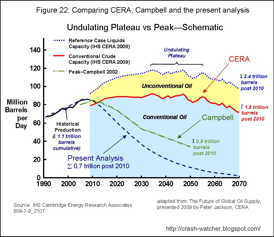
To this, I have added the predicted global production from the present analysis (i.e., cumulative 7-region analysis to predict global production—Figure 20 above). 

Also illustrated below in Figure 23, is the IEA’s estimates of future production, reproduced from the IEA’s World Energy Outlook 2008, which are about the same as CERA’s. 


CERA, the IEA and my present analysis are all in agreement in that the total amount of petroleum produced to data equals about 1.1 trillion barrels.

However, my present prediction of Q¥ equal to 1.8 trillion barrels is much more pessimistic than CERA’s and the IEA’s prediction that Q¥ equals about 4-5 trillion.    Again, CERA’s and the IEA’s predictions look similar to my single Hubbert Equation analysis presented above.

My prediction is even a bit more pessimistic than Campbell’s 2002 prediction, in that I am estimating that only 0.7 trillion barrels of recoverable oil remains in 2010, whereas Campbell’s 2002 prediction estimates 0.9 trillion barrels.  I am not aware of a more recent prediction made by Campbell, that considers at least some of the last 8-9 year’s worth of data, but it would be interesting to see how this would have changed Campbell’s prediction, if any.

Interlude: A North American Consumption Fantasy

(Except for portions of the first paragraph to follow, I do not believe that the scenario laid out below is very likely to occur—but I have set this scenario up for illustrative purposes, as will soon become apparent.)

A new President of the USA is elected in 2012 with a super majority in both the house and senate.  By 2012, the economy is back in decline, unemployment is higher than ever, the ranks of bankrupt and homeless people are still on the rise, oil is at $250 per barrel and gasoline prices in the USA are at 8 dollars a gallon.  The people demand a return to the good-old days.

Unfortunately, the President-elect is a complete math moron and sociopath, and, he is surrounded by advisors that are also morons and sociopaths.  In his first state-of-the-union address, the President makes the following announcement:

I will never, never, never, allow the people of America to freeze in the dark.  America has the most powerful military, by far, on the planet.  Access to cheap oil is in the vital interests of the USA and therefore I am justified in using any means to secure this oil.  Therefore other people of the world must be made to suffer so that the American dream may continue on uninterrupted. 

Being a moron, the new President believes that the only way to prevent Americans from freezing in the dark, and to continue the American dream, is to ensure that per capita oil consumption continues at its long-standing rate of 21 barrels per person per year (b/py). 

Back to the new President’s speech:

Therefore I am announcing here today a new free energy doctrine (FED).  To fulfill the mandates of the FED, I am immediately declaring war on all countries of the world outside of North America.  From this point forward, the rest of the world outside of North America must reduce its oil consumption to the equivalent of 2 b/py and also give the remainder of their oil resources to the USA, for free, so that we, the great people of America, may maintain our current petroleum consumption at 21 b/py.  If any country refuses to comply with the FED, I will kill everyone in that country by releasing factor X.

Factor X is a very special weapon that only kills humans, doesn’t do damage to the petroleum infrastructure, and, then dissipates immediately.  Also (to make this fantasy work), the US military has been training an unlimited number of soldiers to be petroleum engineers and technicians, who can, after killing everyone, drop in and operate all of petroleum production and refining facilities in a country so that its production rate can continue unabated.  Fortunately for Mexicans and Canadians, applying Factor X in these countries would cause too much collateral damage in the USA.  Besides, including Mexican and Canadians as part of the FED in thought to helps secure the USA against domestic terrorism.  Of course, marshal law is introduced in North America and all elections are suspended indefinitely in this state of emergency.

The few protests against this unilateral action are quelled when the President announces a new stimulus bill that includes supplying every household in America with a flat screen TV, an i-pod and a 10 mpg SUV.  Also, gasoline prices are rolled back to $3/G by presidential decree.    During the President’s speech, Factor X was unilaterally released on a few cites around the world just to show that the President was not kidding.  Any individuals in the military or public objecting to committing genocide by releasing Factor X on civilian populations in the world are labeled as traitors or terrorists and put to death immediately.

Okay, enough of that, Figure 24 shows the consequences of such a scenario:   

(5-9-11: revised figure 24 and narrative to account for the changes in NA data in Figure 18 from Part 5; the overall changes are very minor)

My scenario assumes that from 2012 forward, NA’s consumption (solid brown line) equals its population (as projected by the US census bureau) times 21 b/py.   The rest of the world’s (WO) consumption (solid pink line) is assumed to equal to its population times 2 b/py.  The solid red line shows the sum of these two consumption sources, which would equal the world’s predicted total consumption for this scenario.   The open circles, in matching colors, show the 1965-2009 reported world petroleum consumption, reported consumption from NA and reported consumption from the rest of the world (WO).

As illustrated in Figure 24, NA’s consumption rate from 2012 and on continues along its recent upward trend as the population increases at about 1%.  The good-old days have returned!  In contrast, the rest of the world suffers an immediate 40% drop in consumption, but then resumes an upward trend as world population continues to increase. 

The cumulative amount of petroleum produced (Q), shown as the blue line (amounts in billions of barrels according to the right axis labels), illustrates the looming problem with this fantasy scenario. 

If NA’s and the rest of the world’s production is allowed to continue as assumed here, Q is reached in 2036-2037 at which point production drops to zero for everyone—only 26 years from now.

Of course, the year when Q is reached and production hits zero can be hastened or postponed by increasing or decreasing the rest-of-world’s assumed consumption rate: at 4 b/py, Q∞  is reached in 2028; at 1 b/py Q∞  is reached in 2047; and at 0 b/py Q∞  is reached in 2064.  Petroleum production rates hitting zero would probably put the world back at a century or more in standard of living.

Additionally, this fantasy scenarios does not even consider the likely increased energy costs (i.e., decreasing ERoEI) associated with extracting the last few percentages of petroleum as we approach Q. 

I hope that this little interlude illustrates why having the “most powerful military on the planet,” a sociopathic leader, the assumption of no detrimental ERoEI effects going to 100% ultimate recovery, and even magic factor X,  still doesn’t solve the predicament that the USA is in.  The USA’s consumption rate must go down—its time to grow up and deal with it.
--------------------

In the seventh part in this series, I will discuss the correlation between petroleum production and population growth and possible future trends in population change in view of declining production.

Monday, April 18, 2011

Part 5 Predicting regional petroleum consumption in a post-export world

In part 2 and part 3 of this series, I presented my regional analysis of global production and consumption trends for the Middle East (ME), Former Soviet Union (FS), Africa (AF), South America (SA), Asia-Pacific (AP), Europe (EU) and North America (NA).  In part 4, I put the regional analysis together to show that net-exports from the four exporting regions (ME, FS. AF, SA), will end in about 2030-2035. Here in part 5, I apply the same data to predict what petroleum consumption rates will look like for each of these regions as the global net-export pool declines to zero. 

But first, here’s the “tweet” version of my analysis:

Consumption drops worldwide with total collapse in EU & AF, & near collapse in AP. 
SA and FS are better off, with NA & ME even better.   

For those few remaining, it may have become apparent to you by now that something has got to give between the predicted future consumption trends and the future export trends for these seven regions.

Except for EU, whose consumption rate appeared to have peaked in 2006, the other major importers AP and NA, and even the exporters, except for ME, are all on trends for consumption rates to increase and peak sometime in the next five years.   Peak consumption for the two biggest importers, AP and NA, are both predicted to occur in 2013.  Peak consumption is also predicted for AF in 2013 and for FS in 2014.  Finally, the ME is predicted to reach peak consumption in about 2028. 

Consistent with these trends, there is a predicted peak in demand for petroleum imports for the three major importing regions in the mid 2010s to early 2020s: 2015 for AP (-6.9 bbs/yr), 2021 for EU (-5.1 bbs/yr) and 2022 for NA (-4.5 bbs/yr). 

Over this same time span, however, as illustrated in Figure 8 (in part 4), we see the trend for the sum of exports from ME, FS, AF and SA to be in steep decline and to reach zero by 2030-35 depending on the assumptions made. 

When it comes to a struggle between declining exports versus increasing import demand, I'm putting my money on declining exports—that is, I don't believe these projected trends for consumption rate increases over the next five year, will be reached in view of declining global export trend presented in Part 4.  The imports must decline, and of course, declining consumption rates will follow. 

My analysis of the production and export trends allows me to estimate future consumption rates for the seven regions.  Let’s see what those declining consumption rates will look like in that critical period from 2010 to 2035 when net exports are predicted to end, and, in the post-export period thereafter.

Predicting future global petroleum consumption trends—methodological considerations

To make these predictions, I assumed that the present proportions of imports going to AP, EU and NA will all stay the same as they have been over the part 5 years.  I further compare the assumptions of the "sharing" or "no sharing" as applied in Part 4, to AF and SA, who become ex-exporters after 2018.

To estimate the relative proportions of imports going to these three regions, I looked at the reported net imports for AP, EU and NA for the past five years, calculated the percentages for each of these regions, and then determined averages (± sd) as summarized in Table 8 below:


Table 8 proportion of imports going to AP, EU and NA


Average Imports 2005-2009 (bbs/yr)
Average Percent Imports
AP
6.3 ± 0.2
44.0 ± 1.7
EU
4.0 ± 0.1
28.4 ± 0.4
NA
4.0 ± 0.3
27.6 ± 1.9

SUM
14.3 ± 0.3
100

The very attentive reader might notice that the average total imports to these three regions looks to be about 1.3 bbs/yr larger than the pool of global net exports from ME, AF, FS and SA, which is about 13 bbs/yr over this same period (Figure 8), and, you would be right. 

This gives me another opportunity to rant about the BP data base.  For the last 30 years, the BP data base has reported a total world petroleum production rate that is always lower by about 1-1.5 bbs/yr than the reported total consumption rate.  I can't find any explanation for this discrepancy in the BP data base itself.  Because of the consistency of reported production always being lower than reported consumption this doesn't look like a random statistical aberration or rounding error.  The last year where the reported production was greater than reported consumption was 1980. Then, from 1980 back to 1965, reported production rate is always greater than the reported consumption rate.  Perhaps in 1981 BP changed in the way the data were collected or estimated, I don't know.

Although I have no explanation for this trend, I think my approach of working with proportions, as done in Table 8, helps to mitigate this apparent anomaly.

The attentive reader might also wonder about whether it is appropriate to estimate the average proportions from the last five years only.  This is a judgment on my part, based on the recent trend of the changes in these proportion, as summarized in Figure 10 below.


In the 1960-80s, there was a long-term downward trend for the proportion of EU's imports to decrease, but this trend has flatten out over the last decade.  This is probably due to declining intra-regional production from the north sea producers Norway, UK and Demark.  There is also a long-term upward trend for the proportion of NA's imports to increase, but this has also flattened out over past several years.  The trend of AP's proportion of imports to increase is still quite strong.  However, if the proportions going to EU and NA are in flat, and exports from ME, AF, FS and SA are flat or going down, then the upward trend for AP will likely also have to flatten out.  My compromise was to use the average proportions going to these regions over the past five years.

Alright, with this background out of the way, let's consider the predicted consumption trends for the seven different regions.


Asia-Pacific 

Going forwards, if AP continues to import 44 % of the diminishing global export pool, then its consumption will be limited to the sum of this proportion of available exports plus AP’s own regional production, shown in Figure 3 of Part 2.  The available export pool changes somewhat after 2018 as AF and SA become ex-exporters, depending whether or not we assume the "sharing" or "no sharing" scenario applies to these regions.  As I explained before I expect something in between no sharing and total sharing to occur.

Figure 11 shows the reported consumption rate and predicted consumption rates for either scenario (solid line and dashed lines). 


I believe that the sharp ~1 bbs/yr drop between the reported production in 2009 and the predicted consumption in 2010 is due to above-mentioned systematic discrepancy in the BP data base between total production and total consumption—this gets propagated through the calculations of total exports from the ME, AF, FS and SA regions.  It is most prominent for AP, because AP imports the largest proportion of its total petroleum consumption needs of all seven regions.  For instance, in 2009 AP only produced 30% of the petroleum it consumed (2.9 bbs/yr produced and 9.5 bbs/yr consumed); the remaining 70% came from outside of AP.

If these trends continue, then as illustrated in Figure 11, consumption will strongly decline.  The consumption declime will have to follow the declining trend in global net-exports, until zero net exports is reached in 2030, or, 2035, depending on the "sharing" or "no sharing" assumption made.  At that point, consumption becomes limited by the region's own internal consumption ("intra-regional consumption"). 

As Figure 11 illustrates, the impact of the "sharing" versus "no sharing" assumption is relatively minor.  Either way, we have consumption declining from about 8.5 bbs/yr (2010) to less than 2 bbs/yr in 2030-2035—an 80% decrease!  This dramatic decline in consumption simply reflects the fact that AP is highly dependent on global oil imports from outside of the region and the fact that its intra-regional production (Figure 3 in Part 2; reproduced in Figure 11 as the dash blue line) is comparatively low.

North America

Applying the same assumptions in the same way as described above for AP, we arrive at the predicted consumption curve shown in Figure 12. 


According to the BP data set, in 2009,  NA produced  4.9 bbs/yr of the 8.3 bbs/yr it consumed—that’s 59% percent.  This means that the remaining 41% of NA’s consumption was from the global export pool. Once global exports end in 2030-35 NA’s consumption would be limited to its intra-regional production, represented as the dashed blue line in the figure (reproduced from Figure 7 in part 3).  The predicted consumption rate in 2030 (3.6 bbs/yr) is 43% of present consumption—a 57 % drop.  That’s bad, but not as bad as the 80% drop in consumption for AP.  The reason why the drop is not as bad is because NA’s intra-regional production is larger than AP, and its present consumption rate is smaller than AP's—so basically there is a shorter distance to fall.  That’s about as optimistic as I can get in this analysis. 

Europe

Again I apply the same assumptions as described above for AP and NA to arrive at the predicted consumption rate curve shown in Figure 12. 


My first reaction when I generated the data for this plot was, “bloody hell, Europe is hosed!” 

My reaction is still the same every time I look at this figure. 

The 80% and 57% decline in consumption for AP and NA may look harsh, but a 100% decline?  Things are far worse for EU because, like AP, EU is heavily dependent on global exports, but, when global exports end in 2030-35, EU’s intra-regional production is already done.  There is no intra-regional production to fall back on.

In 2009, EU produced 1.6 bbs/yr of its 5.6 bbs/yr consumed—that's only about 28% of its total consumption.  The other 72% comes from imports.  Intra-regional production is in rapid decline, however, so by 2030 EU’s intra-regional production is predicted to be less than 0.1 bbs/yr.  If EU continued to import about 28% of the global export pool, and, that export pool goes to zero by 2030-2035, well, then consumption will collapse from the present consumption rate of 5.6 bbs/yr to less than 0.1 bbs/yr.  That is a very long hard fall in a relatively short period of time.

One short term solution to delay this collapse would be to import a higher proportion of the global export pool.  But which of its import competitors will be willing to give up more of the oil they import—AP or NA?  Both of these regions will also be suffering their own harsh declining consumption rates due to the declining global export pool plus declining intra-regional production.  The global import market for oil will be very competitive, and I can’t imagine what prices will go up to, before governments step in and impose rationing. Still where will the EU get its oil from?
  
Another short term solution is to “convince” the exporters ME, FS, AF or SA to cut their own domestic consumption so that EU can import more.  Hey, maybe we can call it a democracy movement and replace the current despot with another friendlier despot that is more willing to sacrifice the domestic oil consumption of its people—no, no, that sound too ridiculous, no one would think that would work, would they? 

Okay, lets move on and see what the four exporter’s consumption rates may look like going forward.

Africa

As an exporter, AF's consumption rate trend can continue until it hits zero net exports; then it will rely on its internal production, plus any amounts it can import from ME and FS until 2030-2035 when net exports from ME and FS end.  Thereafter AF, like any other importer region must rely on its own production.

Figure 14 shows the two sharing and no sharing scenarios.


My initial reaction to this was about the same as it was for EU—total collapse of consumption rates in AF is likely by 2030.

Because the production rate (dashed blue line) for AF is on a sharp downward trend, if there is no sharing from ME or FS in 2019, after AF hits zero net exports, then AF consumption rates will be in sharp decline and essentially reach zero (> 0.1 bbs/yr) by 2030.  If the total sharing scenario applied, then the collapse in consumption rates would be postponed by a dozen years, but then collapse occurs more sharply to less than 0.1 bbs/yr in 2030.  I am expecting the reality to be somewhere in between these two scenarios, but either way after 2018, there will be a sharp down turn in consumption from about 1 bbs/yr in 2018 to less than 0.1 bbs/yr.  This may be every bit as bad a collapse as predicted for EU although the distance fallen is not as far.  On the theory that "the shorter distance to fall the better," then perhaps AF will more easily adapt to a post-petroleum future than EU, for instance. 

AF's imminent collapsing production also suggests that a strategy by the EU that continues to rely on AF as a major supplier of its imported oil past 2018 is not a very good one. 

South America

Similar to AF, as present exporter, consumption rates in SA can continue on its current trend until 2018 when it also hits zero net exports.  Under the no sharing scenario, SA would have to rely on its internal production.  With the sharing scenario, the decline in consumption can be postponed for 12 years.  Figure 15 shows these two scenarios.


The downward trajectory in production is not as bad as for AF because SA still has significant intra-regional production after 2018 or even after 2030 (dashed blue line).  In fact, from present consumption levels of 2 bbs/yr, a fall to 1.6 bbs/yr by 2030 is only a 20% decline.  Not too bad in comparision to the other regions.

Under the "shorter distance to fall the better," theory, SA may be better shape than AP or NA, and certainly better off than EU.  The steepness and relative drop in consumption would be slightly worse if SA continued on its present consumption rate trend to 2.4 bbs/yr by 2030 and then drops down to an intra-regional production level of 1.5 bbs/yr in 2031—a 38% drop.

Overall, SA looks better positioned to tolerate the end of global exporter in 2030-35 because its present consumption rate is fairly low and it will continue to produce at almost the same level that is presently consuming.  Consumption will decline, but the decline is in a more gradual manner than seem for AP, NA, EU or AF. 

Former Soviet Union

Figure 16 shows the predicted consumption rate trend.  As an exporter, FS's consumption can continue until it hits zero net exports in 2033; then it must rely on its internal production.  Sharing or not sharing with ex-exporters like SA or AF after 2018 doesn’t change the consumption scenario for FS.  Rather, this just cuts into excess production (solid blue line compared to dashed blue line) that otherwise would have been exported to AP, EU or NA. 


FS’s fairly flat consumption trend could continue unabated until it reaches zero net exports in 2033.  Thereafter FS is on a fairly sharp consumption decline because by then, FS will be in the tail end of its production rate (blue dashed line).  By 2055, FS’s consumption would be less than 0.1 bbs/yr. 

Middle East

Figure 17 shows the predicted consumption trend.  Similar to FS, as an exporter, consumption can continue until ME reaches zero net exports in 2035 and then it must rely on its internal production.  As pointed out for FS sharing or not sharing with ex-exporters like SA or AF after 2018 doesn’t change ME’s consumption trend. 


After reaching zero net exports the downward trajectory in consumption is fairly sharp as ME is also on the tail end of it's production rate curve (dashed blue line).  But consumption doesn’t decline to less than 0.1 bbs/yr until 2080.

Summary

Europe and Africa are on track to have total collapses in petroleum consumption by 2030.  The trend is for Asia-Pacific to have a near total collapse with an 80% decline in consumption by 2030.  North America’s consumption will decline by 57% and South America’s consumption will decline by about 20%.  The former Soviet Union can continue it flat consumption rate trend until 2033 and the Middle East can continue its grow trend in consumption till 2035.

It might seem that the Middle East, Former Soviet Union or maybe South America, would be in the best positions to tolerate the end of the petroleum age, however, I would like to make the case for an alternative surprise candidate: North America.

I make this suggestion based on a comparison I made of the per capita consumption trends for the seven regions.

The US Census Bureau International Database provides population data from 1950, and projected population trends till 2050, for nearly every country in the world, and also provides regional population data for NA, SA, AF, EU and FS.  The population data for ME and AP are buried within a larger region of “Asia” as defined by the census bureau, so I had to calculate the populations from the individual countries to match the BP-defined regions of ME and AP.   

Composite plots of the reported (1965-2009) and predicted (2010-2050) per capita consumption in units of barrels per person year (b/p·y) trends for seven regions are shown in Figure 18.


(4-23-11: the profile for ME in figure 18 was corrected because the original figure used census bureau population data for ME from 1950-1995 instead of 1965-2010; double check all other regions; corrected narrative to follow)
(5-9-11: the profiles for NA and SA in figure 18 were corrected because I failed to recognize that the aggregated population data of the US census bureau does not include Mexico, rather, Mexico get included in South and Latin America. Last time I checked Mexico is still part of North America. Argggg.... I went back to correct the annual populations for NA to include Mexico and for SA to exclude Mexico. This reduced NA’s and increased SA’s per capita consumption; correct the narrative to follow)
(5-26-11: the profile for EU was corrected because I failed to recognize that the aggregated population data of the US census bureau for EU also included Russia. Russia as part of Europe, what are they doing? Anyway, correct the annual populations for EU to exclude Russia. This reduction in EU’s population causes its per capita consumption to be slightly higher; correct the narrative to follow)

While NA’s per capita consumption has ranged from 20-21 b/p·y since 1981, only three other regions, EU, FS and ME, have broken the 10 b/p·y level. For EU this level of consumption only last from 1971 to 1980, and for FS, it lasted from 1974 to 1991. ME broke the 10 b/p·y barrier in 1997 and has been steadily increasing it per capita consumption to 12 b/p·y. EU has been in a range of 9-10 b/p·y since 1970, and SA has been in the range of 3-4 b/p·y since 1970. AP has steady increased from 1 b/p·y in 1980 to 2.5 in 2008. AF has never been greater than 1.2 b/p·y.

Eventually, the decline in exports and declining intra-regional production will cause NA's per capita consumption to decline below that of ME in 2020, and ME assumes leadership as the largest per capita consumer for the next 38 years. But ME’s declining production, which is declining faster than NA’s, and increasing population, which is increasing faster than NA's, causes ME’s per capita consumption to drop below that of NA in 2048.

By 2048, NA’s per capita consumption of 3.9 b/p·y is about the same as SA’s present day per capita consumption (4.4 b/p·y in 2009), and lower than FS’s present day per capita consumption (5.1 b/p·y in 2009), and EU’s (9.4 b/p•y in 2009). NA declines to EU's present day value by about 2026.

This suggests that NA, due to its lower population growth rate and lower rate of decline in production, has the potential to transition over the next 20-25 years to a lower petroleum consumption rate that is comparable to something the same as FS or SA today.

A pessimistic viewSome people will see this as a shocking decline in standard of living.
To those who see it this way, I ask, just where are you going to go to avoid this?

I suppose that you could move to ME in 2020. However, for reasons that I have explored in several previous posts (Bahrain's central location and geopolitical importance to the US and KSA; Survey of Oil Exports from North Africa; Survey of Oil Exports from the Middle East ), I don't see the ME as being some island of stability over the next 20-30 years. To the contrary, as different countries in the region hit zero-net exports domestically, there will be great risks of political instability that could spill over to the remaining oil exporters. Nearby oil-hungry regions like AF and EU will be eyeing the remaining sources of petroleum, and I expect that there will be continuing attempts to take the oil by force.

What about EU? Its per capita consumption is predicted to drop below that of FS in 2017 and then below that of SA in 2018 and then below that of AP 2032. It will join AF at the bottom with essentially no per capita consumption (0.03 b/p•y) in 2035. This could be very ugly indeed.

AP's high dependence on imported oil looks is very worry some. Of course there are many areas in AP, like rural India and China, that never been a petroleum-driven economy, and have very low per capita consumption rates. But still a petroleum driven agriculture has driven the production of food, which in many areas of AP now have to import. Moreover, the large cities in AP, I think, are going to have real problems in sustaining and feeding themselves, if petroleum exports decline and then go away entirely.

SA an FS are possibilities, with SA looking the better of the two in terms of a more gradual decline than FS. Still, NA consumption per capita looks to will remain much higher than either of these two regions for the next 50 years. As a previous commenter on this site pointed out, the USA has plenty of energy slack and many improvements in energy efficiency could made without too much pain.

A (sort of) optimistic view

Other people will see my comments about North America as being way too optimistic.

To those who see it this way, I just want to point out that although NA will likely have continued high levels of intra-regional production and moderate population growth, it also has the farthest to fall in terms of per capita consumption.

From a previous post on a related topic, I estimate that that the last time the USA had a per capita consumption rate of 3.9 b/p·y was 1915-1920. Perhaps for NA that number gets bumped up a bit as Mexico's present day consumption is only about 7 b/p·y. At the steepest part of the declining per capita consumption curve from 2012 to 2018 (Figure 18) I estimate the annual decline to be -3 %/yr. The corresponding relative annual drop in standard of living will likely be a gut-wrenching experience for most of the families who will live through this transition. Still, where else would you rather be? Going from 18.1b/p·y in 2010 to 7.4 b/p·y in 2030 will not be easy, but, I would rather do that than go from 9.4 b/p·y to 0.9 b/p·y as EU is projected to. To put it another way, given a choice, I'd rather be living in the per capita consumption equivalent of UK or Mexico in 2009 (10 and 7 b/p·y, respectively) than in Sudan in 2009 (0.8 b/p·y; estimate from Relating Per Capita GDP to Petroleum Consumption and Exports for the MENA Countries).

                                                              ---------------------
This is the analysis that just keeps on giving. Based on my regional analysis presented in part 2 and part 3, I can now make some predictions about peak oil and total recoverable oil (Q∞) in these regions and globally, as well as give a longer term perspective on global petroleum consumption and population growth and decline. I hope you will join me next time when I explore these topics.