Like Algeria, Angola has supplied substantial amounts of oil to the USA for at least the last 35 years. According to data in “Total Imports,” at least since 1985, Algeria has been among the top 10 of total petroleum importers to the USA.
Angola, after winning its independence from Portugal in 1975 fell into a 27-year civil war with the main two warring faction being the Soviet Union/Cuban-supported MPLA and the USA/South Africa-supported UNITA.
A third but important faction is the FLEC “Front for the Liberation of the Enclave of Cabinda.” Cabinda is important because that is the province where the majority of Angola’s petroleum comes from via off-shore oil fields. Cabinda province is isolated from the rest of Angola by the Congo. Although the civil war in Angola is officially over, the sub-factions FLEC are still an active militant force destabilizing Cabinda.
After a formal cease fire in 2002 Angola Angola China has played a major role in the rebuilding of Angola ’s infrastructure, no doubt in the hopes of gaining increased access to Angola Angola : China Angola may have just become China ’s top import source in 2010, surpassing Iran and Saudi Arabia (see e.g., Angola becomes China China and Angola Angola -China Angola in order to get a better deal from China , or, a true change in attitude towards China
In 2007 Angola Angola Angola

Nevertheless, the EIA country analysis brief points out that there are several up and coming off-shore projects in development and these projects, once online, should add substantially to Angola
Despite limitations imposed by OPEC, companies operating in Angola
Additionally, the EIA reports expected increased production in several existing fields which would push the production capacity even higher. So, that jump in reserves in 2007 could be reflective of these new sources of oil—its not clear to me if all of these are figured into the 13.5 bbs estimated reserve or not. Nevertheless at least to take advantage of this new capacity under the OPEC quota system, I expect to see Angola
According to the EIA country analysis brief, Angola’s exports in H1 2009 were split between about one-third going to the Americas (mainly the USA and then Canada) one-third going to Asia (mainly China, India and Taiwan) and the remainder going to Europe and South Africa:


As a compromise between applying this linear trend versus just taking a 5-year average, for the export analysis to follow, I have assumed that the percentage of Algeria ’s exports to the USA
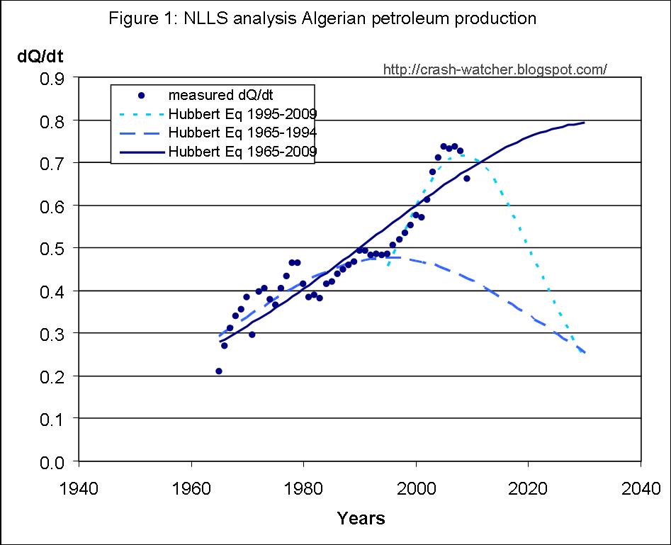
Non-linear least squares (NLLS) analysis of total petroleum production
Figure 1 shows total petroleum production for 1965-2009 as reported in the BP statistical review.

As I would expect by now with this sort of data, the Hubbert equation fit to the full data range blows up and looks essentially like an exponential fit (“a” = 0.0815; Qo = 0.22; Q∞ = 7124). A Hubbert equation fit to the sub-period 1982-2009 also blows up and looks about the same (not shown; “a” = 0.0822; Qo = 0.85; Q∞ = 42082). Extending this prediction curve out to about 2030 would put Angola ’s production rate on par with Saudi Arabia , which I don’t think is realistic given what is presently known about the size of Angola
As shown in Figure 2, fitting the Hubbert equation to the sub-period 1982-2001 did not blow up (long dashed line; “a” = 0.158; Qo = 0.43; Q∞ = 7.23) and fitting the sub-period 2001-2009 also did not blow up (short dashed line; “a” = 0.240; Qo = 1.05; Q∞ = 11.47). However, the sharp downturn in the fit to the 2001-2009 period, in my opinion, does not seem realistic given that there are several new projects about to come online in the mid 2010s, and, that will take the production up to about 3000 mbd (equivalent to about 1.1 bbs/yr).

To produce a more reasonable model of production than an ever increasing exponential curve, I repeated the Hubbert equation fit to the full data range but with Q∞ fixed to the sum of annual production from 1965 to 2009, 8.3 bbs, plus the reported proven reserve of 13.5 bbs (i.e., Q∞ =21.8 bbs). It was apparent that using the sum of production to date plus 1x proven reserve value as the value of Q∞ doesn’t give a very good fit to the existing production data, as the best fit using this Q∞ predicts a peak production rate that is less than the present production rate.
In fact, as shown in Figure ,1 even setting Q∞ equal to 2x or 3x the reserve (i.e., 35.2 and 48 bbs, respectively) still doesn’t given a very good fit to the recent existing production data. For instance as the best fit using the Q∞ at past production plus 2x the reserve value put the production rate lower than the EIA’s expectations regarding the upcoming projects and the total production capacity of about 1 bbs/yr . The past production plus 3x the reserve value put production rates above 1 bbs/yr, but not until the mid 2020s which is a decade later than the EIA prediction. Finally past production plus 4x the reserve value (Q∞ = 61.5 bbs) puts production at about 1 bbs/yr by 2016 which is pretty close to the EIA’s expectations regarding the timing of the upcoming projects and the added production capacity.
Therefore, for the export analysis to follow, I have used the best fit of the full time range to the Hubbert equation with Q∞ fixed to 61.5 bbls. More on this assumption at the end of the article.
Non-linear least squares (NLLS) analysis of total petroleum consumption
The BP statistical review does not split out the data from Angolan petroleum consumption, so instead I used the consumption data from 1980-2009 as reported in the EIA’s Angola Energy Profile.
Figure 3 shows the Angola

Note that the vertical scale is an order-of-magnitude lower than the scales shown in Figures 1 and 2—that is, like Algeria, historically, Angola has not used much of the petroleum it produces. Of course, the quarter-century long civil war would explain this.
Around the late 90s there are some signs of increased consumption and then a substantial (about 50%) increase in 2001. Thereafter consumption continues at this fast rate.
The Hubbert equation to the full data range (solid line in Figure 3) is not very good, so I performed another fit to just the data from 1996-2009 (long dashes best fit parameters: “a” = 0.0837; Qo = 0.11; Q∞ = 11.51). This gives a much better fit, and it is this later fit that I used for my export analysis.
Predicting future trends in Angolan petroleum exports
Figure 4 shows the production and consumption data from 1965-2009 and 1980-2009, respectively, the best fits obtained using the Hubbert equation analysis of the 1996-2009 time period of consumption data and the Hubbert equation fit to the 1965-2009 period of production data with Q∞ fixed at 61.5 bbls:

If these predicted production and consumption trends continue, it suggests that Angola
Impact on USA
Figure 5 reproduces the USA production and consumption data and predicted trends, plus the data from the previously discussed top-seven petroleum exporters to the USA measured and predicted future exports, as presented in my previous article, Trends in Algerian Petroleum Production and Consumption.

Based on the predicted export trend, Angola’s exports to the USA by 2015 are predicted to equal about 0.22 bbs/yr and 0.27 bbs/yr by 2020. That is 143% and 179%, respectively, of Algeria’s estimated exports to the USA in 2009 (0.153 bbs/yr). This upward trend continues until 2027-2030 when the exports peak at 0.32 bbs/yr and then declines as production goes past its peak and domestic consumption in Angola become relatively more significant.
If these trends are accurate, then by 2018, Angola will be second only behind Canada as the most important export source to the USA as Venezuela, Saudi Arabia, Nigeria, Russia and Algeria exports go into decline.
There is more speculation built into these export predictions than I would like, and I could imagine this being on the optimistic side. For instance if the reverse of 13.5 bbs turn out to be an accurate estimates of the present field and new fields about to come on line, then the production curve will follow more closely the curve corresponding to Q∞ = 21.8 bbs. That would leave far less exports, although Angola would still be an important exporter at least out to the early 2030s. Or, if the 15-year trend for steadily declining percentage of exports to the USA continues, then even if Angola had petroleum to export, the amounts going to the USA could become insignificant by the late 2010s. Although I would not discount either of these scenarios, I would like to see more evidence to support them before changing my prediction.
Wednesday, December 29, 2010
I am not happy with the analysis I did of Angola's petroleum production. I describe below my second attempt at getting a more realistic prediction curve.
I was not happy with my previous analysis because I had assumed a Q∞ value that is 4x the estimated reserves, plus past production, to get the dQ/dt value up to level and time frame that the EIA had predicted based on the upcoming projects (e.g., at least ~1 bbs/yr by the mid 2010s) plus the added production capacity. However, there is no basis for my assuming a Q∞ of 61.5 bbs to get to that dQ/dt. Also, in retrospect I realized that it was incorrect to add past production to Q∞ for the purposes of this analysis because I am only trying to cover a time span from 2001 and on. So, Q∞ should have been fixed equal 13.5 bbs.
Also after re-considering this analysis, I realized that I could take a different approach to get the production rate up to the EIA predicted level and time frame: fix Q∞ equal to 13.5 bbs and fix "a" to the best fit value from fitting the sub-period 2001-2009 (short dashed line in Figure 2; “a” = 0.240). In other words assume that production continues at the same rate as it has been in recent years, and, assume that total recoverable oil equals 13.5 bbs.
Figure 6 shows the result of such a fit using the Hubbert equation (alternating two short and one long dashes), again using only the data from the sub-period 2001-2009. Also for reference, I put two "Xs" to mark the spots that would correspond to a production rates of 2.5 mbd (0.91 bbs/yr) and 3 mbd (1.095 bbs/yr) in 2012 which is the production range estimated by the EIA.

Given these assumptions, the production rate would top out at about 0.8 bbs/yr. That falls short of the range predicted by the EIA. That is, even if the production rate continues to increase at its present rate, for the given estimated reserves of 13.5 bbs, we can get to about 1 bbs/yr, which is mid-range of the EIA estimate.
After further reflection, I realized that I could use the "constraints" feature of the SOLVER function in EXCEL to help estimate what the rate of increase in production rate (i.e., what the value of the rate constant "a" would have to be to give a dQ/dt value of 1 in 2012. That is, in addition to constraining the value of Q∞ equal to 13.5 bbs, SOLVER allows me to constrain the value of dQ/dt equal to 1 specifically in 2012. Then I can perform the NLLS analysis with "a" and Qo allowed to vary to get the best fit to the production data for 2001-2009.
The results of this best fit are also shown in Figure 6 (solide line: "a" = 0.297; Qo 0.46; Q∞ fixed to 13.5; dQ/dt fix to 1 in 2012).
As I expected, the value of "a" has to increase to an even higher value ("a"=0.30) than the value of "a" for the best fit for the 2001-2009 period ("a"=0.24). So, we are talking about a year-over-year increase in the production rate of about 30% in order to get to the mid-range predicted by the EIA by the mid 2010s. I suppose that that this is possible, since there an annual growth rate in production of 24% over the 2001-2009 period. But it would have to be one of the steepest petroleum production growth rates that the world has every seen.
Of course, as is inherent for any model based on the Hubbert equation, the decline side of the production curve is predicted to be just as steep as the growth side of the curve. That means that after peaking in 2015 production will drop steeply (i.e., 30%/yr) and as illustrated in Figure 6, by 2016, production will be back down to the same level as in 2009, and by 2021, down to about the level it was at in 2001.
So, in the absence of a further increase in reserves, Angola would have a decade of massive production and then just as rapid a return back to the same levels of production at the end of the civil war—would Angola's leaders really do that? Sure they would, there would be massive some profits to re-building the country's infra-structure, and, some profits for them to gain as well.
Figure 7 is a revised version of Figure 4, using this revised production curve (solid line) shown in Figure 6.

I think that this more realistic production curve gives a more realistic prediction of Angola's exports as it pertains to the USA. This is shown in Figure 8, which is a revised version of Figure 5, above.

The curve still predicts that Angola will be an important petroleum exporter to the USA for the next decade. Based on the predicted export trend, Angola’s exports to the USA by 2012 peaks out at about 0.24 bbs/yr, which is higher than that predicted for Algeria or Russia but less than Nigeria. By 2015, exports are about 0.19 bbs/yr which is still higher than in 2009 (0.15 bbs/yr), but by 2020, down to about 0.06 or about 37% of exports in 2009, and then zero by 2025.