Wednesday, December 28, 2011

Thinking About Risk


We talked a lot about climate change today.  I predict than in three or four years, we won’t be talking about climate change any more.  We will be talking about energy scarcity, or, food shortages, or, declining water supplies.  Not because we have dealt with climate, but because its one of a large family of pressures which are going to mount until finally, physical growth stops.

Dennis Meadows, 2010 lecture, Economics and Limits to Growth, the Population Institute (part 2/3 at ~1:15 minute)

To close out the year, I would like to review and comment on some recent blog articles, all posted within the last month, and, all touching on the same topic, but with slightly different perspectives.  I ask you to seriously consider the implications of these articles with respect to the big picture risks that are bearing down on us.


This article shows the tight relationship between total energy use and GDP for the world and various OECD countries, FSU and China.  The article then goes on to depict the similarly tight relationship between CO2 emissions and energy consumption, and, between CO2 emission and GDP (the ratio ranging from about 0.9 to 0.7 for at least the last 30 years (Figures 12 and 13, respectively reproduced below):

 And here’s Tverberg’s comment, which I think is right on the money (with my emphasis):

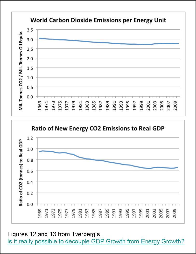
If our intent is really to reduce CO2 emissions, it seems to me that we need to look much more broadly at the issue. Maybe the issue should be viewed in terms of (1) fossil fuel resources that we are willing to use in each future year, and (2) how much real GDP can be created from those resources, given the issues we are facing. The quantity of fossil fuels to be used each future year might consider CO2 goals as well as limits on the amount of oil that can be extracted each year because the “easy oil is gone”. The amount of real GDP that can be created from these fuels would depend on a number of factors, including declining EROI and increasing efficiency.

If the plan is to reduce fossil fuel consumption, then we may very well be expecting real GDP to also decrease, perhaps by a similar percentage. In fact, looking at the experience of FSU in Figure 9, the GDP decline may even be greater than the energy decline.

In a follow-up post, Thoughts on why energy use and CO2 emissions are rising as fast as GDP, Tverberg shows that much of the growth in CO2 emissions from the last 30 years is coming from Southeast Asia (increased oil and coal consumption) and the Middle East (increased oil and natural gas consumption), with the rest of the world being relatively flat during this period (see Figures 1 and 5 of the article). 

Once again, I agree with her analysis:

The industrialization of Southeast Asia has allowed importers from around the world to reduce their energy intensity of GDP, but much of the savings has been offset by greater energy use (largely coal) in Southeast Asia. On a CO2 basis, we are likely worse off, because of this transfer.
....
The Kyoto Protocol inadvertently contributed to a pattern of greater outsourcing to Southeast Asia which was already taking place, raising worldwide CO2 emissions, while it kept emissions nearly flat (and declining relative to real GDP) in the countries doing the outsourcing.

Next up is an excellent post from Robert Rapier’s R-squared Energy Blog, at Consumer Energy Report, the article entitled, How I Would Decide the Keystone XL Pipeline Issue.  Rapier’s figure showing CO2 emissions from the US. EU and Asia Pacific (AP), reproduced below, echoes Tverberg’s posts:
Rapier points out that CO2 emissions from the Asia Pacific are highly unlikely to decline in the near future (again with my emphasis):

My view is that regardless of what actions we take — short of going to war with China and India to stop their economic development — carbon emissions will continue to climb. My hope is that the impacts of climate change will be less severe than the worst predictions, because I see no pathway to stopping them (even if carbon emissions in the West went to zero).
....
I see mostly pie-in-the-sky from people who think we will rein in carbon emissions in China and India (or who believe that the West is mostly responsible for the world’s carbon emissions). Polls have shown that the vast majority of the Chinese are not concerned about climate change, and the vast majority of Indians never heard of it. So when people argue that we must lead by example, 1). Our per capita consumption is already an order of magnitude higher than theirs, thus we aren’t in much of a position to lead; and 2). Even if we were, they don’t want to be led on this issue.

Rapier’s figure reproduced above make the point clear: elevated CO2 emissions over the last 10 years are due to increased petroleum consumption in the Asia Pacific regions.  This figure further illustrates that, even if North America and Europe had cut there CO2 emissions by 50% during that decade, this still would not be enough to offset all of the increased CO2 emissions from the Asia Pacific.

Referring to a funny exchange between Colbert and Bill McKibben (at 5:20 minutes), Rapier comments:

...even those who are most adamant that climate change is such a grave threat that we must take drastic measures to stop it — still rely on oil to do their business. And they really have no idea how society might respond to insufficient oil supplies — yet they are willing to take that risk for us all. But while they are aware of the threat posed by climate change, I get the impression that they are not aware of threats posed by relying on unstable regions of the world for our oil supplies.

Finally, but by no means least, are two interesting posts by David Cohen from Decline of the Empire, entitled: How To Think About The Future and For Humans, The Economy Is Everything.  To fully appreciate these posts in context, you will have to first slog through his earlier post, Economic Growth And Climate Change — No Way Out?.  That earlier article covers similar ground as Tverberg’s, pointing out the tight connection between fossil fuel use, GDP growth, and CO2 emissions, as nicely summed up in Cohen’s two “rules:”

(1) If the economy is growing, then anthropogenic CO2 emissions are growing
(2) If anthropogenic CO2 emissions are not growing, the economy is in recession

In How To Think About The Future, Cohen discusses a recent paper in NATURE presenting various CO2 emission scenarios by the IPCC and predicting how the consequent global warming will trigger a massive release of CO2 and CH4 from the melting arctic permafrost, viz., “the high warming scenario will degrade 9–15% of the top 3 metres of permafrost by 2040, increasing to 47–61% by 2100 and 67–79% by 2300.”

After pointing out how CO2 emissions are a good proxy for economic growth, Cohen rhetorically asks (my emphasis):

...do you find it plausible that the global economy will grow and grow for the next 39 years? If you think this is possible, or even likely, you should worry about CO2 emissions from thawing permafrost. If you don't find DAVE 1.0 plausible, and regular DOTE readers know I don't, you're likely to shrug off this Nature survey about future emissions from thawing permafrost, reasoning that there are plenty of things to worry about; this is only one of them.

For example, what will global oil production be in 2040? What will it be in 2050? In my view, it's not only likely, it's almost a certainty that global oil production will be considerably lower in 3 or 4 decades than it is right now. Perhaps you think that makes no difference to future economic growth. I beg to differ.

More pointedly, in For Humans, The Economy Is Everything, Cohen says:

Homo sapiens—yes, that's you and me folks—is not going to do diddly-squat about climate change. And why not? As if we had to learn this lesson all over again in the three years since the financial meltdown, we have once again discovered that for human beings, the economy is everything.

Stopping or slowing greenhouse gas emissions would require us to shrink the economy instead of trying to grow it. And why is that? Because modern industrial economies require lots and lots of energy to function. As the economy grows, energy consumption grows too. (Efficiency can only take you so far and according to Jevons, makes matters worse over time.) So unless we have alternative "renewable" sources of energy that scale to the levels required to support a growing global economy, we must shrink that economy to reduce emissions from burning fossil fuels. At present, and in the foreseeable future, those viable (scalable) energy alternatives do not or very likely will not exist. Got it? Do not exist.

Comment
I made the title of this post a play on the title of one of Cohen's post, because I think that his article as well as Tverberg’s and Rapier’s posts are talking about risk or relative risk.  All of these posts speak to the same issue: the relative risks of the collapse of civilization due to run-away global warming versus risk of the collapse of civilization due to peak oil, and more generally peak fossil fuels, and, a realistic response to these risks.

The global warming scenarios that come out of the IPCC are all based on variants of the so-called business-as-usual (BAU) assumption: economic growth can continue on at the same rate as in the past 50 years, and thereby generate the amounts of green-house gases thought necessary to cause extreme CO2 emissions and consequent catastrophic global warming.

Underlying the BAU assumption however is a second assumption that there are enough fossil fuels, and in particular, enough of the key fossil fuel for transportation, petroleum, to sustain continued global economic growth.  A third assumption is that "we," meaning the governments and people of North America and Europe, by using less fossil fuels (e.g., by driving electric cars and setting up wind turbines and solar panels) can prevent catastrophic global warming.  Finally, a fourth, perhaps less explicitly stated assumption is that "we" must focus all of our efforts and resources into doing this RIGHT NOW, because it is the most important imminent risk that civilization, and all life on the planet, has ever faced.

Here then is my view of the risk scenario for catastrophic global warming and its possible mitigation.

I have several problems accepting this scenario and its mitigation:

1) There is good evidence that the world is at peak petroleum production now, and that future production will steadily decline and the fossil fuel reserves assumed to exist by the IPCC scenarios are several times overestimated (see e.g., Akelett's and Ypersele’s presentations and subsequent discussions at ASPO 9 which I previously reviewed here).

2) Petroleum is the key fossil fuel "driving" all major modes of transportation, and supporting BAU economic growth, and therefore, economic growth can no longer happen “as usual” in the face of declining petroleum production.

3) Because CO2 emissions are intimately tied, a proxy, as Cohen puts it, to economic growth, and, because the burning of fossil fuels, especially petroleum, is a prerequisite for economic growth, the levels of atmospheric CO2 are likely peaking now. 

4) As Tverberg’s and Rapier's articles nicely illustrate, even if North American and European governments could get a political mandate to make an all-out effort to cut their fossil fuels consumption, the increased fossil fuel consumption in the Middle East and Asia Pacific would totally offset and likely exceed these efforts. 

5) If “Cohen's rules” are correct, then North American and European governments attempting an all-out effort to rapidly decrease their fossil fuels consumption, e.g., at a greater rate than the rate of increased consumption elsewhere, such an effort would likely accelerate economic collapse in North American and Europe.  And, per point (4), this would have substantially no effect on decreasing global CO2 emissions, because CO2 emissions would continue to growth in the Asia Pacific and Middle East. 


In my opinion, governments, at all levels, would be better off thinking about how to mitigate a peak fossil fuel catastrophe scenario:

In addition to a collapsing economy, with all of its ensuing problems (high unemployment, loss of purchasing power due to inflation/deflation in no particular order, loss of capital and credit for investment, social unrest, war, etc...), a major concern is that the petroleum-driven food production system will experience a sharp decline as petroleum production declines.   In view of continuing population growth, even a modest decline in food production rates will cause starvation, which in turn, will lead to social unrest and ultimately, war, over the remaining fossil fuel resources, in particular oil.

Under this scenario, moderate global warming may still occur, but it is an after-thought, in view of all the other immediate problems.  As Dennis Meadows suggests, in a few years we will be talking about energy scarcity and food and water shortages, not climate change.

Can/will countries get ahead of this problem? 

Well, I think that positive steps could be taken to mitigate the problem, although the prospects of implementing mitigation scenarios any times some don’t look very promising to me. 

First, mitigation would require recognition and acceptance by governments, and the general population, that we are at or near peak oil now, and that there is no realistic energy replacement waiting in the wings—especially a replacement for the liquid transport fossil fuels.  

There are signs of government and other bodies starting to at least consider the problem (see e.g., Eric Townsend’s peak oil resources page) although I am unaware of any government that has actually taken legislative action aimed at curbing the future effects of peak oil. 

Second, governments could take several steps, such as suggested in The Impending World Energy Mess (e.g., fuel efficiency mandates, oil sands development, coal-to-liquids, gas-to-liquids), to mitigate the rate of decline in liquid fuels, and thereby slow the rate of economic and food production decline. 

I just don’t see any of this happening soon.  To the contrary, the environmental movement’s influence on politicians to make the reduction in CO2 emission in North America and Europe a first priority will likely stall a number of these mitigation efforts until there are frank fuel shortages.  In the absence of mitigation, price spikes, fuel shortages and subsequent rationing will come sooner and harder. 

Third, I would hope that about the same time price spikes and rationing starts, there will be a major effort underway to develop and implement a “Green Revolution 2.0” that is not so dependent on fossil fuel inputs to produce food.  Local food production on multiple small farms using permaculture principles and human and animal power, is a good candidate as Green Revolution 2.0.  Plus, having a much larger portion of the population being directly involved in food production would give the growing millions of unemployed people a meaningful livelihood. 

However, once again, I don’t see governments doing anything to promote a “back to the farm” movement. 

To the contrary, the US government appears to be intentionally shutting down smaller farming operations by swamping farmers with a myriad of regulations and requirements, and by allowing the patenting laws and enforcement run amuck in the agriculture realm.  For instance, listen to this Jim Puplava interview of Kristin Canty the producer of Farmageddon, or, this G&B interview of Percy Schmeiser, the Saskatchewan farmer and seed developer who fought Monsanto—and lost.  If the trend continues, by default, the only commercially produced food left to buy will be that produced by the large petroleum-driven industrial-type farming operations.  This does not bode well at all for the level of preparedness of the country when declining petroleum production starts to limit food production. 

In my opinion, a combination of fuel conservation, alternative liquid fuel development and a Green Revolution 2.0 could moderate the decline in food production, but probably still not enough to totally prevent starvation and death.  But, perhaps it would be enough to prevent major resource wars and a rapid die-off.  Perhaps, what could emerge is a sustainable no-growth civilization. 

Living in a net no-growth or de-growth society, is a foreign experience to pretty well everyone alive today.  How people adapt to this reality in the coming years will be a major challenge at a personal level as well as at the community and country level.

Hopefully, in 2012, we will start to see more movement in these directions, or, at least increasing recognition of impending peak oil and its risks.

---------------------------------------
Out with the old in with the new!  I am happy to add Tverberg’s, Rapier’s and Cohen's to my blog role to the left. 

Thanks to all of you who have visited this site over this past year, and especially those who have taken the time to leave comments.  I hope that you continue to find it to be of some use. 

Monday, December 19, 2011

Trends in Indian Petroleum Production, Consumption and Imports

In this post, I summarize my export land model analysis of India using the published petroleum production and consumption data from the BP Statistical Review for 2011. 

India's rate of petroleum consumption for the last thirty years has been exponentially increasing and out-striping Indian's domestic production which is in a flat-to-declining trend.  In 2010, India imported 75% of its petroleum, mostly from the MENA countries.  This trend, of increasing dependence on foreign petroleum imports, is likely to continue, at least until the global export pool declines. 

Data Analysis Method
My approach to data analysis is the same as what I have done in the past in my multi-part global regional survey.  In that survey, India was part of, the numbers for the Asia-Pacific region, and like China, I regret not having separated out India from the rest of the Asia-Pacific in that analysis—next time I will.)

All production, consumption and import/export rates (dQ/dt) are reported in units of billions of barrels per year (bbs/yr).  I used the production and consumption data to derive a “reported” net exports (or imports), as production minus domestic consumption.

I fit a logistic models (aka, the Hubbert Equation) to the petroleum consumption and production data using non-linear least squares (NLLS) analysis to obtain the best fit.  Further details of the modeling are presented in the series: Refining the peak oil rosy scenario.  Predicted future import/export trends are derived from the predicted production rate minus the predicted consumption rate.

Where appropriate, I have made comparisons to China.

Production, Consumption and Export/Import Trends
Figure 1 presents the reported production, consumption, and my derived net export/import, rates (blue, red and green open circles respectively) and the corresponding NLLS best curves (solid lines with the same respective colors) to these data. 

 
The reported production rates and consumption rates both have a fairly uniform shape and therefore fitting a single Logistic equation to each of these data sets is appropriate. 

In Figure 1, the vertical scale to show extrapolated future consumption is so large that the reported past production and consumption numbers are somewhat obscured, so I show the same data in an expanded scale, in Figure 1a.

It is apparent that India has long been a net petroleum importer, as indicated by the negative reported net export values since at least 1965.  Domestic production had steadily increased, until the mid 1990s, but has been flat since then.  Accordingly the logistic equation fit to the production data predicts a long slow decline in petroleum production.  For instance, by 2030 India petroleum production is predicted to be about the same as it was in 1972, when India’s population was “only” 580 million.  In contrast, in 2010, India’s population had doubled to 1.17 billion.  But more on that later.

The trajectory of India’s petroleum consumption looks steeper than its production curve.  Consequently, India is importing increasingly larger proportions of its consumed petroleum.  For instance, in 1990 Indian domestic production provided 59% of India’s consumption, and the remaining 31% was imported.  By 2010, India’s domestic production, almost the same as it was in 1990, only provided 25% of India’s consumption, with the remaining 75% being imported.  If the best fit curves accurately predict future production and consumption, then by 2020, India’s production will only provide 9% of consumption and the remaining 91% would have to be imported. 

According to best fit Logistic equation, India’s consumption would top out at 1.78 bbs/yr in 2029, but, because by then, production will have declined even more: consequently, 96% of India’s petroleum consumption would have to come from imports.  Peak imports are predicted to occur shortly thereafter in 2031, at 1.71 bbs/yr being imported, corresponding to roughly 96% of India’s projected consumption.

The NLLS best fit parameters Qo, Q∞ and the rate constant, "a," corresponding to the solid lines in Figure 1 are summarized in Table 1 below:

Table 1 Summary of NLLS best fit parameter for production and consumption


Qo (bbs)
Q∞ (bbs)
a (yr-1)
Production 1965-2010
0.41
13
0.093

Consumption 1965-2010
1.36
106
0.067


The estimated Q∞ values reflect India’s historic and likely future need to import petroleum—the estimated ultimately recoverable petroleum of only 13 bbs, is about 8 times lower than the estimated ultimately consumed petroleum.  The rate constants for production and consumption are also interesting in that they suggest that India’s rate of increase in production of 9.3 %/yr actually exceeded it’s rate of increasing consumption of 6.7%/yr.  Incidentally, that annual rate of increase in petroleum consumption is pretty close to India’s annual rate of GDP growth from 2000 to 2010 of 7.4%/yr (see India GDP Growth Rate).  Not a coincidence, I beleive.

India’s petroleum Import sources
According to the EIA, India, in 2010 was the world’s fifth largest importer of oil (Country Analysis Brief India).   

So just where is that oil coming from? 

The EIA presented break down of India’s import sources, in its 2010 Country Analysis Brief, reproduced in Figure 2:

About 85% of India’s imports are from the MENA countries, in particular, Saudi Arabia and Iran.  Probably, the Indians, like the Chinese, would be very happy if North America and Europe  were to sanction the importation of petroleum from Iran, because this would make more Iranian oil available to these countries (see e.g., INDIA SEES NO ISSUES WITH IRAN OIL IMPORTS). 

Indeed, like China, the percentage of India’s imports of the global export pool from 1993 to 2009 has been steadily increasing and looks to have accelerated in the last few years:   

The estimate of the global export pool comes from my previous study examining the production, consumption and net interregional exports for seven world regions (Figure 8 from Estimating the End of Global Petroleum Exports: Part 4 future global net export trends).  That earlier study showed that the ME, SA, AF and FS regions are net petroleum exporters and that the NA, EU and AP regions are net importers.  I predicted that inter-regional net exports would steadily decline, and then end sometime between 2030 and 2035, depending on whether the remaining exporters were to share or not share the remaining export pool with ex-exporters.

Figure 3, illustrates that, despite signs of diminishing export sources, India is projected to take an increasing portion of the available petroleum export pool.  India’s share of the sum of net exports from this pool (mainly ME and AF) have increased linearly, from 2.8 percent in 1994, to 6.4 percent in 2009.  The slope of the linear regression analysis of these data equals 0.18 percent/year (r2=0.84).  More recently, however, in 2005-2009 this percentage increase of the export pool per year has accelerated to 0.6%/yr (r2=0.99). 

Just like China, however, I don’t see how this import trend, and hence the predicted consumption trend in Figure 1, can continue for India. 

To illustrate the reasons for my skepticism, let’s consider some potential petroleum consumption scenarios.

Different scenarios considering India’s future petroleum consumption
If the present trends of production and consumption continued unabated, as suggested by the blue and red lines in Figure 1, then by 2030, India would be producing only 0.07 bbs/yr, but consuming 1.78 bbs/yr, and as noted above, 96% of that consumption would have to come from imports. 

The problem with this scenario, as represented by the solid red line in Figure 4 (scenario I), is that India’s imports most likely will be abated.  They will be abated by at least two factors: the diminishing export pool and increased competition for that diminishing export pool, in particular from China.
For instance, if the trends predicted in my previous multi-part global regional survey are correct, and the world’s inter-regional net exports end sometime between 2030 and 2035, then India’s consumption has to fall back to its own domestic production by then. 

Figure 4 presents three different increasingly pessimistic trajectories by which this could happen.

In scenario II (short red dashes), I assume that India is able to continue its most recent four-year trend of expanding its proportion of importation from the inter-regional net export pool, as shown in Figure 3 (light blue line), right up to the end of exports in 2035 (assuming a no sharing scenario as further explained below).  Even so, scenario II predicts that India is at peak petroleum consumption now, essentially because the rate of increase of the percentage share of the global export pool is less than the rate at which the size of the export pool is decreasing—hence the total amount of petroleum decreases, until the global export pool “runs dry” in 2035. 

In scenario III (alternating short and long dashes), I assume that the percentage of India’s proportion of the inter-regional net export pool stays frozen at its 2009 amount of 6.4 percent, and, I further assume that there is no sharing of the remaining export pool with former exporters as they become ex-exporters.  According to this scenario, there is a steep decline in India’s petroleum consumption, until the global export pool runs dry in 2035, and then India is back to relying only on its small domestic production. 

In scenario IV (long dashes), I again assume that the percentage of India’s proportion of the inter-regional net export pool stays frozen at its 2009 amount of 6.4 percent, but this time, I assume that there is sharing of the remaining export pool with the ex-exporters.  Of course, this causes the global export pool to run dry sooner (i.e., by 2030 instead of 2035,  as assumed for scenarios I-III).  Consequently, the decline in India’s petroleum consumption is even steeper, and India is back to  relying on its domestic production by 2030. 

I think that scenarios II, III and IV all illustrate that, if India is to expand its consumption of petroleum, even in the short term, then it must import much greater proportions of the inter-regional net export pool.  Specifically, that light blue line in Figure 3 has to be even steeper in order to service the consumption curve predicted by the solid red line in Figure 4. 

Figure 5 presents these four scenarios again, but this time in terms of per capita petroleum consumption, specifically, in units of barrels per person per year (b/py).  Figure 5 also shows India’s reported and predicted population change out to 2050 (from the US Census Bureau International Database). 

Unlike China, whose population is predicted to top out at about 1.4 billion in 2026 and then slowly decline thereafter, India population is predicted to just keep growing to 2050 and beyond.  Indeed, India is projected to overtake China as the most populated country in the world by about 2025.  By 2050, India's projected population of 1.66 billion will be half-a-billion people larger than it’s 2010 population of 1.17. 

This expanding population, I think, presents India with an insurmountable predicament with respect to food production. 

Even if India could import petroleum at the increasing rate as it has in the past, and, there was unabated consumption (scenario I), India’s per capita consumption still only remains slightly over 1 b/py until 2040, after which it drips below 1 b/py. 

A per capita consumption of 1 b/py is the amount I have estimated to be the bare minimum to sustain a petroleum-driven industrial food production system. 

This may explain, at least in part, why India’s Global Hunger Index (GHI) has been among the highest in the world for the last decade (see e.g., The relationship between hunger and petroleum consumption). 

For instance, with a GHI of 24.1 in 2010, the International Food Policy Research Institute ranks India’s extent of hunger as “alarming.”   India’s GHI actually declined since 1990, with a GHI = 31.7 a ranking of “extremely alarming” hunger.  This is consistent with India’s increasing per capita petroleum consumption, from 0.53 b/py in 1990, to 1.02 b/py in 2010.   With an unabated increase in petroleum consumption, GHI could decline further, at least until 2025, when per capita petroleum consumption is predicted to top out at about 1.25 b/py.  Then per capita petroleum consumption is predicted to decline, and along with it GHI. 

More likely, in my opinion, something closer to one of scenarios II, III, or IV will occur, in which case, India’s per capita consumption is going to start declining now.  The decline is because of the combination of declining imports and increasing population. For instance, India’s per capita petroleum consumption is predicted to drop back down to 1990 levels by 2025 for scenario II, and by 2018 for either of scenarios III or IV.

But unlike 1990 when its population was 0.84 billion, India’s population is predicted to be 1.3 billion in 2018 and 1.4 billion in 2025. 

I have great difficulty imagining how it would be possible to feed an additional 0.5 billion under these circumstances of declining per capita petroleum consumption.

Conclusions
India, even more so than China, relies on petrolum imports.  If petroleum consumption were to continue unabated, India’s projected petroleum imports would have to substantially increase to 96% of consumption by 2030.  Expecting India to able to obtain this level of petroleum imports, I think, is very problematic. 

First, there is my expectation of the export pool of petroleum to diminish and essentially reach zero in about 2030-2035 depending on the sharing scenario as explained above.  Second, India will be direct competition with China to import petroleum from the diminishing export pool. 

Because of India’s high reliance on imports, and, a domestic production capability that is much smaller than China’s, the peaking and decline in the export pool spells disaster for India’s economy, and even more importantly, failure of the petroleum-driven food production system. 

Starting in about 1991, in the face of the collapse of the Soviet Union, a domestic balance of payments crisis, and having to borrow from the IMF, India was forced to transition away from socialism and towards capitalism and globalism.  As an aside, at least part of that balance of payment problem in 1991 was due to the loss of the Soviet Union as a trade partner and the rise in oil prices due to the Persian Gulf War precipitated by Iraq’s attack of Kuwait.  The Persian Gulf War, in turn was precipitated by the collapse in oil prices and hence Iraqi revenue, with Iraq blaming Kuwait for driving down oil prices by exceeding their oil production quota (see e.g., 1991 India economic crisis;  Pathways Through Financial Crisis: India; Gulf War; Making of a Payments Crisis: India 1991; India’s New Foreign Policy Strategy).  India today is even more reliant on oil exports than it was in the 1990s, which in turn, makes India’s economy even more vulnerability to oil price fluctuations than it was in the 1990s. 

While the prospects of economic expansion look quite dim, I think that quite soon, India will have much bigger problems on its hands: food shortages and starvation. 

Based on scenarios II-IV, India is soon going decline below 1 b/py per capita petroleum consumption, and this in turn, is going to affect India’s ability to maintain, let alone expand, its domestic food production system; at least a food production system that is petroleum-driven. 

Based on this analysis, I am sorry to say that it is hard for me to see anything but food shortages, starvation and population decline in India’s near future. 

------------------------
Coming up: my export land model analysis of food energy production for India; see you then.

Saturday, December 10, 2011

Chinese food energy production and consumption: an export land model analysis

Past series (starting here and here) have defined units and the terms used here, and, explained how I derive food energy contents for the various food items reported by the FAO, and how these aggregated data can be used to estimate overall food energy production, consumption and export/import rates for individual countries, regions, or the entire world. 

This analysis shows that China has long been a net food energy importer, although the trend as accelerated in the past decade.  Throughout, where pertinent, I will point out differences compared the USA’s food energy situation, the details of which have been presented previously starting here. 

Net Food Energy Production for China

Figure 1 shows the time course of the changes in total net food energy production (blue), and the two major subcategories of plant-derived and animal-derived net food energy production, and its population:

China’s total annual net production rate (blue circles), has increased from about 2067 PJ/yr in 1961, to about 9754 PJ/yr in 2007.   That’s a 4.7 times increase, which is much greater than the 2.4 times increase in the USA food production over the same period.  In part, this dramatic percentage increase is because China's food production was so low in 1960s. 

For instance, I find it amazing that in 1961, with a population (661k), over three times larger than the population of the USA (189k) at the time, China produced 2067 PJ of food energy, only 63% of the food produced in the USA (3246 PJ/yr in 1961). 

It looks like China’s total net food energy production overtook the USA’s total net production around 1983, and is now substantially higher than the USA’s (7871 PJ/yr in 2007),   But of course, so too is its population, at 1.3 billion in 2007 (versus only 0.3 billion in the USA in 2007); a doubling since 1961.

As illustrated in Figure 1, plant-derived food energy dominated China’s food energy production until about 1985, when animal-derived food production started to increase.  Consequently, animal derived food production has risen 22 times from nearly nothing in 1961 (52 PJ), to 1172 PJ in 2007.  That’s right, a 2,200% increase!  Still in 2007, 88% of food energy production is derived from plants, with the remaining 12% derived from animals.  This proportion of animal-derived food energy is actually higher than in the USA in 2007 (about 10% in 2007). 

I think that these dramatic increases in China’s food production are all signs of the petroleum-driven Green revolution having occurred in China throughout the 70, 80s, and 90s, but, more about that later.

You can see from Figure 1 that the rate of Food production especially from 1961 to 2000 has outstripped the population increase. For instance, the average year-by-year population change from 1961 to 2007 equals 1.5±0.6 percent, while the average yearly change in net food energy production equals 3.3 ± 3.4 percent.

However, since about 2000, there are signs that the rate of food production is slowing down (arrows) compared to the longer trend.

Figure 2 shows this slowing trend more explicitly, presenting the 5-year averages of the year-to-year percent changes in net food energy production (total, animal and plant), and, the population change.     

Similar to the USA, the 5-year average of year-to-year change in total net production are quite variable, ranging from 8.6%/yr in 1962-66, to only 0.52%/yr in 2002-07, with even wider variation in animal-derived food production, no doubt because the starting number in 1961was so small!  In comparison, the 5-year average year-to-year change in population has been steadily declining, e.g. from 2.2%/yr in 1962-66 to only 0.66%/yr in 2002-07. 

Figure 3 presents the same data as in Figure 2, but as a scatter-plot of the 5-year averages of the year-to-year percent changes in population and food energy production as function of the mid-year of each 5-year averaging period.  The solid lines show the linear regression best fits.

Figure 3 shows the strong linear trend (r2=0.89) for the decrease in the growth rate of in population and more scattered (r2=0.41) declining trend in the net food energy production growth rate. 

Are these statistically significant linear relationships?
I used the EXCEL function LINEST to generate the F value for these regressions lines: 58.3 (population) and 5.9 (food production).  The EXCEL function FDIST (n=9, df=7, so v1=1 and v2=7) was used to estimate the probability of a higher F value occurring by chance alone: 0.000123 (population) and 0.045 (food production).  So yes both of these are statistically significant relationships; although the higher scatter in food production growth means that my assurance of its predictive capability is less than future predictions of declining population growth.

Extrapolating these linear regression lines suggests a cross-over in about 2013-14 (i.e., the food production growth rate less than the population growth rate) and both of these reaching zero growth at or before 2020 (specifically zero food production growth by 2016 and zero population growth by 2020). 

Of course, food production growth dropping faster than population growth is not a good sign—it means that the difference would have to be made up with imports. 

Contributors to Net Food Energy Production
Figures 4-7 presents major food items that contribute to the plant-derived and animal-derived net food energy production rates.
Plants
Figure 4 illustrates that, as noted above, as a percentage of the total food energy production, total plant-derived food energy dominated food production (e.g., 97% of total production in 1961, staying above 95% until 1986), and is still very important at 88% in 2007. 

Similar to the USA, of the seven subcategories of plant-derived food energy depicted in Figure 4, cereals are the major food type produced in the China, ranging from 68% of total production in 1976-79 to 53% in 2007.   All of the other food types make relatively minor contributions (less than 10%) to net food production.

Figure 5 focuses on relative contributions of the "big four" plant food items that were important in my previous post (starting here) analyzing the world-wide production trends: maize (corn), wheat and rice, and, soyabean plus oil from soyabean. 

The sum of these four food items has provided anywhere from 52% to 64% of total net food energy production in China from 1961 to 2007.  The most recent 2007 value 56% is in about the middle of this range.  This is somewhat less than the contribution from these four food in the USA (about 75% in 2007).

Not surprisingly, rice is THE major food energy item produced in China.  But, after peaking in 1972, at 34% of total food energy production, the proportion of rice’s contribution has been steadily declining and in 2007, was at its lowest proportion ever, at 19.7%.  Surprisingly, to me at least, is that corn (maize) has made up for a good amount of rice’s decline.  Corn is everywhere, even in China, it seems. The proportion of corn’s contribution has increased from 11% in 1961 to equal the same as rice, 19.7% in 2007.  So, in China, corn is now just as important as rice, at least in terms of food energy.   The proportion of food energy coming from wheat has also increased, up from 8% in 1961 to 13% in 2007; it looks like wheat’s relative contribution peaked in 1985 at 17%.

Corn’s rise to prominence in China is still far below that of the USA—in the 2007 corn accounted for 45% of total food energy production in the USA, while rice was less than 1%.

Figure 6 shows the relative contributions from all nine different cereal items separately identified by the FAO: Wheat, Rice, Barley, Maize, Rye, Oats Millet, Sorghum and “Other”

This plot show the historical dominance of Rice as the most important cereal crop and the subsequent rise in corn and wheat.   I wish I new what “other” corresponds to in China, as something other than the 8 specific cereal has played an important role, and, then has dropped off a cliff since about 2003—but I have no idea what that sereal item could be.  Any ideas, anyone?

All of the other cereals, Barley, Maize, Rye, Oats Millet, Sorghum, have also dropped in significance since the 60s and 70s.  Rice, corn, wheat, and "other," is where it is at in China.

Animals
Figure 7 shows the stupendous rise in animal-derived food energy from a mere 3% of total food energy production in 1961 to 12% in 2007. 

This trend is almost the complete inverse to that of the USA, whose animal-derived food energy has declined from about 14% in the early 60s to about 10% since then.  Meat-derived food energy accounts for the bulk of the animal-derived food energy increase in China, although all the other categories depicted in the figure have also increased.

Consumption of Food Energy
Figure 8 shows the distribution of the Domestic Supply of food energy in China:

Clearly, the human food energy supply has been, and remains the major use of domestic food energy, although its proportion has been steadily declining from 68% in 1961, to 54% in 2007.  Food energy for feed, processed food and other uses of food (all except seed) have increased, but still even in aggregate, they account for only about 45% of domestic food energy use.

These proportions of domestic consumption differ significantly from the USA’s, where Feed is the dominant domestic food energy use.  For instance, in 2007 food consumption for feed was at 34% of the total domestic food energy supply in the USA, and the human food energy supply accounted for only 30% of domestic food energy consumption.

Net Production, Consumption and Net Imports
Figure 9 shows China’s annual food energy net production and consumption (domestic supply) and the difference—growing net imports (i.e., shown as negative exports) since the mid 1970s:
Whereas the USA is a net food exporter, China is a net food importer.  For instance whereas the USA, net exports equaled 1616 PJ of food energy in 2007, China net imported 903 PJ of food energy.

The trend has been for food imports to be increasing, although as a percentage of total domestic consumption imports are still small.  For instance, in 2007, net food imports (903 PJ) only accounted for 8.5% of total domestic food energy consumption (10659 PJ).  Still, the separation between what domestic food production provided versus domestic food consumption has increased since 2002, and, appears to be growing.

This trend is shown more clearly in Figure 10, which presents the China’s food imports as a percentage of total food energy production.  To be consistent with previous posts in this series, I present this as a negative number to make clear that these are net imports and not net exports.  The year-to-year variation is quite large, but still, the recent trend for growing food imports is apparent.

It is interesting that food imports are growing even though the rate of population growth has been declining (e.g., see Figures 2 and 3 above).  Perhaps the growing importation of food reflects China’s growing wealth and the ability to pay for food imports.  Or, the growth in food imports reflects a topping out in China’s ability to further increase its food production.  It is probably bit of both, I suspect.

As discussed in the context of Figure 3 above, China’s rate of decline in food production growth appears to be falling faster than the rate of decline population growth, so increasing food imports to make up the difference would make sense, as illustrated in Figure 11:

Figure 11 show the absolute total food energy exports (red) and imports (blue), and net difference between these two (green), which corresponds to the same net export values shown in Figures 9 or 10.
Figure 11 illustrates that food exports have increased about 1.8 times from the mid 80s, (i.e., from 168 PJ in 1985 to 302 PJ in 2007).  But food imports have increased by more than doubled that amount over the same period: a nearly 5 times increase (i.e., a nearly 5 times from 246 PJ in 1985 to 1205 PJ in 2007). 

This is quite different than the import/export picture in the USA, which has had net exports over the last 50 years (albeit flat for the last 30 years). 

Details of net Food Imports into China
Figure 12 shows the net food energy imports derived from plants in total (blue circles), and for several different major categories of plant food items: 
In 2007, of the 902 PJ in total net imports, 862 PJ, or 95% were from plants.  As shown in Figure 12, after being slightly positive in 2003, and negative the year after, the sum of cereal export/imports have been neutral since then.  For the past several years, plant-derived imports have been increasing, mainly from the oil crops and the vegetable oil crops. 


Figure 13 show the food enery imports for the "big four" plant food items; as illustrated, recently maize, wheat, rice are essentially export-neutral, but soyabean and soyabean oil (i.e., the major contributors to vegatable oil crops and vegetable oils in Figure 12) have been major net imports.  In the past, however, there have been periods of cereal import spikes—mainly due to the importation of wheat–centered around 1982, 1988 and 1995. 

These years also coincide with some years in the USA which also had downturns in cereal production, suggesting that there may have been world-wide conditions responsible for these downturns in cereal production.  

China's plant import situation is quite different than the USA, which is a strong net cereal and soyabean/soyabean oil exporter, and even rice exporter. 
It is amusing to think that some of the USA’s net rice exports wind up being exported to China. It turns out that this idea is not too far fetched (see Is China gearing up to import U.S. rice?).  Similarly, the USA is ramping up corn exports to China, thereby in part causing corning prices to increase (corn-based ethanol production being the other part cause price increases; see Markets Hub: U.S. Corn to China Export Quadrupled; USDA Sees More Corn To China).  
A good portion of the soyabean imports could be helping to sustain China’s domestic consumption of food energy as feed (Figure 8) as it deals with severe droughts in the north and as rising incomes allow people to consume more meat (see China's grain demand should boost U.S. exports).

Figure 14 shows the net food energy imports derived from animals in total (blue circles), and for the different subcategories of animal-derived food items. 

The total animal-derived food imports are quite small compared to plant food import, e.g., -41 PJ for animal-derived food energy in 2007, compared to -862 PJ for plants.  Imports of seafood and animal fats have been increased the most over the last 20 years.

China’s Production, Consumption and Imports on a Global Scale
Figure 15 shows China’s food energy net production, consumption, and net exports, as well as population, all as a percentage of their respective global counterpart amounts (which I derived in a previous series of posts here).  

The black line and x’s show that for the last half-century at least, China’s population corresponded to about 20 to 23 % of the world’s population.  Since peaking at 23% in 1975, this proportion has declined to 20% in 2007.  The percentage decline probably reflects both the declining rate of population growth in China (Figure 2 and3) and relatively higher population growth rates in other parts of the world. 

Despite having a declining percentage of the world's population, China’s food energy production and food consumption have dramatically increased as a percentage of the world’s food energy production or consumption.  For instance, in 1961, China with 21.6% of the world population, produced and consumed only about 11% of the world’s food energy.  But in 2007, with 20.3% of the world’s population, China produced and consumed 17% and 19% of the world’s food energy, respectiuvely.

The difference in production and consumption has been made up by tapping into the global food export market.  In 2007, China’s food imports accounted for 8% of the total amount of food energy exported world-wide.

Components of China’s domestic food energy consumption compared to global counterparts
Figure 16 shows the major categories of the China’s food energy consumption, expressed as a percentage of its global counterparts. 
For reference, total domestic consumption (solid red circles and line “% global domestic supply”) is the same as the red line presented in Figure 15.  Also for reference, I show the population as percentage of global population (black xs and line).

As you can see, for the last half century, the proportions of all of these categories have been less than the proportion of China’s relative global population.  That is, even though it has 20-23% of the world’s population, China’s proportion of world food energy consumption for seed, feed, processed food, other uses, and the human food supply, have all been less than 20-23%. 

By the way, this is the complete opposite than for the USA, where all of these components of US food energy consumption are higher in proportion than the USA’s relative to the global population.

China’s relative under-consumption of food is changing however.  The proportion of each one of these categories (except seed) have increased, and in some cases, exceeded 20% of world wide use.

For instance, by 1996, China’s human food energy (pink circles and line; 21.5% of world human food consumption) increased to equal its percentage of the world’s population (21.5%).  Similarly, China’s use of food energy for "other" non-food uses exceeded it's percentage of the global population in 2002 (brown squares and line).  The proportions of food energy consumption of feed and processed food are also on the rise, and will probably also eventually meet or exceed 20% of their respective global amounts, if the trends continue.

Figure 17 focuses in on China’s human food energy consumption of plant and animal food energy relative to the counterpart world human food energy consumption amounts:
Again, for reference, I show  the percentages of the total human food supply (same as the pink line presented in Figure 16), and China’s population (black line and x’s), relative to their global counterpart amounts.  The total human food supply is the sum of plant-derived food for human consumption (blue circles and line) and animal-derived food for human consumption (green circles and line). 

As I mentioned in the context of Figure 16, China’s proportion of the consumption of food energy for human use increased to equal China's proportion of the global population in 1995, and, as better illustrated in Figure 17, since then, has continued to equal or slightly exceed China’s percentage of the global population. 

The percentage of plant-derived human food increased since 1961 to finally equal China’s population percentage in about 1983 (22.2%) and has tracked with China’s population percentage since then. 

Animal-derived food for human consumption had much larger ground to make up.  In 1961, China’s use of animal-derived food for human consumption only amounted to 3.1% of the world-wide amount of animal-derived food for human consumption. 

That’s an incredibly small percentage, considering that in 1961, China had 21.6% of the world’s population. 

It took until 1998 for China’s consumption of animal-derived food to equal 21.7% of the corresponding world-wide amount (21.3%).  Since then, China's proportion of animal-derived food for human consumption has continued to increase beyond it population proportion.  In 2007 China, having 20.3% of the world’s population, consumed 23% of the global animal-derived human food supply. 

Summary and Conclusions

China’s increase in food energy production since 1961 is even more remarkable than the USA’s; a 4.7 times increase (Figure 1) versus the USA 2.4 times increase.  Like the USA, China experienced its petroleum-driven green food revolution.   However, China is showing signs of topping out in its ability to continue expand its food energy production at the same rate as it has in the past  (Figures 2-3) and is now increasingly turning to food imports. 

At the same time, China's petroleum domestic production and foreign imports have dramatically increased (see Figure 1a of Trends in Chinese Petroleum Production, Consumption and Imports).  For instance, since 1965, China’s domestic petroluem production increase from 0.065 bbs/yr to 1.5 bbs/yr in 2010—that’s whopping 2300% increase!  But, the domestic consumption of petroleum has increased even more, and consequently, China became a net importer of petroleum, in 1993. 

The year 1993 also happens to be about the last year that China was close to being net neutral in food energy imports (see e.g., Figure 11) .  Since then, food imports have been increasing.

So, China has become an increasing net food importer, since the early 1990s, despite the fact that its per capita petroleum consumption has more than doubled.  For instance, per capita consumption of petroleum in 1993 was 0.93 b/py (barrel per person per year), and by 2007 it was 2.18 b/py; a 2.3 times increase (see Figure 5of Trends in Chinese Petroleum Production, Consumption and Imports).  Over this same period, however, food energy production increased by only 1.3 times (7433 PJ in 1993 to 9756 PJ in 2007). 

I think that the slow down in food production growth in the face of increasing per capita petroleum consumption, could be an indication that other factor(s) have started to limit China’s ability to increase it domestic food supply.  One or more of water and soil depletion, climate change, urban encroachment of farm land, the migration of people from rural to urban settings and the aging of farmers, could be limiting food production. 

Fortunately, the decline in food production growth is also occuring at the same time the growth rate in China’s population is in decline.  Indeed, sometime around 2020-2021, China’s population will stop growing (Figure 3).  The trouble is that food production growth might reach zero before then (Figure 3).

Additionally, the trend has been for China to consume greater proportions of the world food energy supply.  That is, China is consuming amounts of food energy closer in proportion to its population, and, has also increased its appetite for animal-derived food (Figures 15-17).   These factors have driven China towards being an increasing net importer of food. 

Perhaps, on the bright side, China’s growing need for increasing food imports will provide the USA with a means to improve its trade deficit with China.  On the hand, I don’t see any signs of the USA increasing its net food exports (see e.g,, Figure 9 of the USA study), so China might have to import its food from elsewhere (e.g., Africa and South America).

For the near term, to me it looks like a horse race between China’s ability to keep up domestic food production and importing increasing amounts of food, versus the declining rate of population growth, and with it, hopefully, a decline in domestic food consumption.  For the longer term, the declining petroleum export pool over the next 20 years will start to affect China’s ability to produce food domestically, as per capita petroleum returns to about 1 b/py and food import prices increase and/or exportable quantities of food decrease. 

12-11-11: updated figure 7 and 14 to explicitly state that "meat" includes offals, and, to show fish oil (fish liver oil plus fish body oil) as a separate category.

------------------------------

So, where to next? 

Since we already in the Asia Pacific region, how about India