Saturday, November 17, 2012

Predicting Global and Regional Petroleum Consumption Trends Part 8: Japan

Most of my introductory remarks about Japan (JP) to follow are based on two EIA reports: a country analysis report on Japan, and, a report on the East China Sea. 

It might seem odd to include JP, a relatively small country, in a nine-region global analysis of global petroleum consumption trends.   However JP’s petroleum consumption as a country is third only to the USA and China.  As you will see, not too long ago JP’s annual consumption rate was over 2 bby and it was still about 1.6 bby in 2011.  That makes JP’s consumption rate greater than the entire African continent’s consumption rate (about 1.2 bby), about the same as the entire former Soviet Union region (1.5 bby) and little bit less than South America (2.2 bby) in 2011.  Oil is Japan’s single largest source of primary energy at 44% of total energy consumption, although this has been falling over the past decades in favor of natural gas and nuclear power, at least until the earthquake and tsunami in March 2011. 

What Japan does not have, is substantial domestic petroleum reserves.   Citing the Oil and Gas Journal, the EIA states that JP’s reserves of oil are only 0.044 bbs (i.e., 44 million barrels).  There is much talk and intrigue about JP having access to “domestic” reserves in the East China Sea, south of Okinawa, in an island chain called Daioyu/Senkaku (Chinese/Japanese name).  As the dual naming implies, there is an ownership dispute for these islands between China and Japan. 

The EIA estimates that the East China Sea has between 0.06 and 0.10 bbs of oil in proven and probable reserves, but, China’s estimates of “undiscovered resources” runs much higher, at 70 to 160 bbs.  Of course, even 0.1 bbs of oil is worth a lot of money, but, as far as having much impact on meeting JP’s present oil consumption (presently about 1.6 bby), this is negligible— about 1 month’s supply.   However, a reserve of 70 to 160 bbs is a very different matter—maybe enough to go to war over, some suggest.  Personally, I think that there would have to be "proven and probable reserves" of at least 16 bbs (e.g., about ten year’s worth of JP’s present consumption) to make it worthwhile for JP and others (e.g., China) to fight over any time soon.

In view of JP’s lack of domestic oil, it should be no surprise that JP’s present consumption rate is almost totally reliant upon the continued importation of oil from one or more of the other eight regions featured in this series. 

Let’s take a look at what regions Japan imports its oil from, and, what the import trends from those regions to JP look like. 

Japan’s production, consumption and net export trends: an ELM analysis
My usual source of data, the BP Statistical Review, reports JP’s petroleum consumption rate, but, does not report information about JP’s domestic production rate—I suppose because the number is too small to meet the Review’s reporting criterion.  Therefore, the data for JP’s production was from the EIA’s International Energy Statistics Division, corresponding to the EIA’s  “total oil supply,” which reports back to 1980.

Figure 34 presents the reported production, consumption and calculated net exports rates (dark blue, bright red and dark green open circles respectively) and the corresponding nonlinear least squares analysis (NLLS) logistic equation best-fit curves (solid lines with the same respective colors).  To calculate net exports before 1980 I am assuming that JP's production was equal to zero.  The solid green line before 1980 is based on a back-extrapolation of the logistic equation best-fit to the 1980-2011 EIA data set (see Figure 34a).

At the vertical scale used in Figure 34, you can barely see JP’s miniscule production rate, so I reproduced the production data and the NLLS best fit in Figure 34a, below:
Production rates in JP were modeled using a single logistic equation fits to the EIA total oil supply data for 1980-2011.   Consumption rates in the JP were modeled using two logistic equation fits to the data from 1965-82 and 1983-2011, respectively.

The best fit parameters of Qo, Qand the rate constant "a" are summarized in Table 8 below:

Table 8 summary of best fit parameter for production and consumption data for JP


Qo (bbs)
Q (bbs)
a (yr-1)
Production 1980-2011
0.16
2.3
0.084
Consumption 1965-1982
3.7
41
0.19
Consumption 1983-2011
25
106
0.077

As illustrated in Figure 34a, JP production rate has increased substantially since 1980, although there are signs that the growth in the production rate has stalled-out and in for a decline, as implied by the NLLS fit. 
 
It might seem curious that the production rate in the last several years, about 0.05 bby, actually exceeds the EIA’s estimate of total reserves, of about 0.044 bbs.  The discrepancy is explained by the fact that, by far, the bulk of JP’s production is from “refining gains,” from the country's domestic petroleum refining sector.  For instance, according to the EIA Japan country analysis report, in 2011 of its total 130,000 b/d production rate, JP only produced 5000 b/d of crude oil.  In other words, less than 4% of JP’s production corresponds to actual crude oil being produced domestically. 

Similar to that discussed for Europe in Part 7 of this series (and discussed in Part 10 of my early Trade Movements series) it seems that JP has found a way to profit by importing crude oil, refining the oil domestically, and then re-exporting some of the refined products to other regions.  For instance, according to the EIA (citing the Oil & Gas Journal), JP has a refining capacity of 1.7 bby (4.7 mbd) which is second only to China’s refining capacity in the Asia-Pacific region.  This capacity is actually slightly higher than JP total consumption rate, although JP also imports some refined products in addition to importing crude oil.  Therefore, it would seem that JP has the ability to profit by serving a “middle-man” role exporting to China and the remain Asia-Pacific regain, similar to the way Europe exports to North America and Africa.

Figure 34 shows that JP’s consumption rate has clearly been in decline since the late 1990s.  It looks like the consumption rate peaked in 1996, at about 2.1 bby, and after about 5 years of a shallow decline, the consumption rate started to decline more steeply through the 2000s from 1.97 in 2001 to about 1.61 bby in 2011.  This corresponds to an 18% decline in the last 10 years, or, a 24% decline in the last 15 years from the peak in 1996.  In other words, JP has been experiencing annual declines in its petroleum consumption rate in the range of 1.6-1.8 %/yr for last decade-and-a-half.

If you squint hard at the red circles in Figure 34, you will see a slight up-tick in consumption in 2011 compared to 2010.  This is probably reflecting the effects of the tsunami and subsequent Fukushima Daiichi nuclear plant shutdown in March 2011, and then a country-wide shut down of nuclear power plants.  The slight up-tick in petroleum consumption reflects increased electricity generation from petroleum-fueled generators.   It was only in July 2012 that the first nuclear plants began to reopen, so the trend of increasing petroleum consumption, or at least a less steep decline in petroleum consumption, might continue into 2012 and beyond. 

The order-of-magnitude greater consumption rate (red line) compared to production (blue line) is also readily apparent in Figure 34, illustrating how JP is a huge net importer of petroleum (green line).  Given JP’s low domestic production rate, it is not surprising to see that JP’s year of peak imports was in 1996, the same year as JP’s peak consumption rate.   Still, in 2011, at +1.52 bby in net imports, 94% percent of Japan’s petroleum consumption comes from imports.

Predicting Petroleum Export Rates from JP to other Regions
Figure 35 shows the relationship between petroleum production rates and export rates for JP, as already worked out in my previous study from a few months ago.   This is the same as Figure 4 in Part 2 of “Relationship between Petroleum Exports and Production.”

The proportion of JP’s total exports, expressed as a percentage of production (black Xs, rhs scale), is increasing (r2=0.78).  This linear regression line is likely reflecting the combination of flatting production rates, i.e., flatting refining gains, and increasing refined product exports.  That these percentages are greater than 100% of domestic production is perhaps not so surprising now that we see how JP has been functioning as a middle-man for the regions that export crude oil (i.e., the Middle East) and the remaining Asia-Pacific countries (rAP, blood red line) and China (CH, pink line) who are import JP’s refined products. 

For instance, as illustrated in Figure 35, in 2011, 77% and 15% of JP’s exports went to rAP and CH, respectively, with the remainder going to NA and EU.   In 2011, according to the BP Statistical Review, JP’s total exports to other regions amounted to 0.11 bby (290,000 bpd) of products and 0.00022 bby (1,000 bpd) of crude oil—I wonder where that 1000 barrels of crude got exported to, and, why export it, given JP’s large refining capacity.   In contrast, JP’s total imports were 1.3 bby of crude oil (3,560,0000 bpd) and 0.34 bby (930,000 bpd) of petroleum products. 

Figure 36 shows the predicted absolute regional exports from JP to the other regions, based upon the combination of the production rate trends shown in Figure 34a and the export trend lines shown in Figure 35.
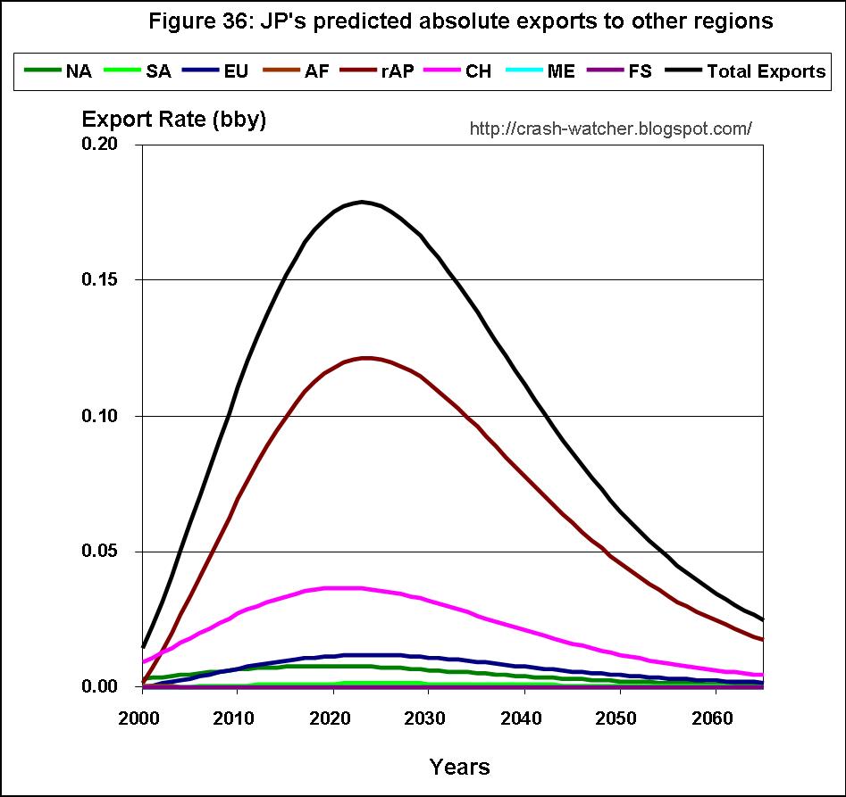
According to this prediction scenario, JP’s exports will top out at about 0.18 bby in 2023, and most of those exports will go to rAP and CH in a ratio of about 3.4:1.  The reason for the downturn after 2023 is due to the predicted decline in domestic production in Figure 34a (again for JP, mostly reflecting declining refining gains as imports decline).  Declining production overcomes the upward export trend shown in Figure 35.  Of course, the absolute amounts of these exports are very small compared to the exports to and from any of the other eight regions considered in this series, although they may be still be important to some countries in the rAP region that gets most of JP’s exports: Australia, New Zealand, Singapore and China.

Predicting Petroleum Import Rates to JP from other Regions
Figure 37 shows the sum (black line), and individual import contributions, predicted for each of the other eight regions, to JP.

In part Part 7 of this series, I showed a pretty grim picture for Europe’s future imports.  But, the import picture for Japan looks even grimmer than Europe’s, mainly because JP is so heavily dependent on the ME for its imports. 

As shown in Part 2 of this series, not only is ME’s production toping out and likely about to decline, but the proportion of ME’s production being exported is strongly trending downwards. Moreover, the situation is even worse for JP, because ME’s downward trend of exports to JP is even steeper than its overall downwards export trend.  This is due to ME’s increasing proportion of exports going to rAP and CH, to the detriment of NA, EU and JP. 

However, of the three regions NA, EU and JP, it is JP by far that is most dependent on receiving imports from the ME.  For instance, from the prediction curves Figure 37, in 2011 about 79% of JP’s petroleum imports corresponding to about 1.2 bby, came from ME and about 10% came from rAP.  Projecting out 10 years to 2022, ME is predicted to still provides 76% of JP imports, but the absolute amount will be only about 0.6 bby, a 50% decrease from 2011.  It is JP's high dependence on ME's oil, as I said in an earlier post would cause JP to be especially devastated by a sudden disruption in oil flow from the ME (see: If the Strait of Hormuz Closed, Which Importing Region Would Suffer the Greatest Loss?). 

The only slightly bright-spot for JP’s future import picture is that imports from FS and NA are predicted to increase (Figure 37, purple and dark green lines, respectively). 

Unfortunately, the rate of increasing imports from FS and NA barely offsets the rate of declining imports from rAP, let alone from the ME.  And, because FS’s production rate is predicted to being peaking about now, absolute imports from this source are likely to go down after about 2017.  Projecting out even farther to 2030, if these trend continue, JP's total imports will have declined to about 21% of its imports in 2011.

Predicting Consumption Rates for JP based on the PIE analysis
Since JP has substantially no domestic petroleum production and minor petroleum exports, it is no surprise to see that my PIE analysis predicts a petroleum consumption rate curve that essentially mirrors the predicted total import curve in Figure 37 (black line).

I applied my normalization to JP in the same manner as done for NA, SA, AF and EU.  For JP, the average calculated consumption rate, based on the summation of production plus imports minus exports for the 2001-2011 time range, was 0.038 ± 0.036 bby lower than the reported consumption rate for JP as reported in the BP review.  Therefore my normalization for JP consisted of adding 0.038 bby to the predicted future consumption rate and adjusting total net exports downwards by this same amount.  And, like the other regions, I did not attempt to distribute this correction proportionally among the individual absolute exports and absolute import to and from each of the other regions.

Figure 38 shows the production, consumption and net export data, and corresponding best fit curves, the later two now shown as dashed lines.  Added is the predicted net export (light green solid line representing total absolute exports minus total absolute imports with the -.038 bby correction) and consumption (blood red solid line) rate prediction curves, based on my PIE analysis (exports minus imports with the 0.038 bby correction). 

The results presented in Figure 38 suggest that, if JP’s production rate follows the decline trend predicted by the logistic equation best fit (solid blue line), and JP’s export and import rates continue along the trend lines shown in Figures 36 and 37, respectively, then the predicted total net export rate curve (solid light green line) is going to continue declining, until about 2041, after which, net export become more negative as imports from NA increase. 

JP’s predicted consumption rate (blood red line) almost exactly mirrors the net export curve, which almost reaches zero in 2041, before going up again slight due to imports from NA.  The predicted rate of decline in consumption is even steeper than the already steep decline predicted by the logistic curve fit to the consumption rate data (dash line in Figure 38 and solid red in Figure 34).  That is an annual decline rate that’s even steeper than the decline rate of -1.6-1.8 %/yr over the last 10 to 15 years.  For instance, the predicted consumption rate is 1.42 bby in 2012 and 0.68 bby in 2022—a 52 % decrease over 10 years or about -5.2 %/y.   That’s much steeper than the consumption rate declines of -2.2 %/y predicted for NA and -3.2 %/yr for EU, earlier in this series. 

Final thoughts
There is a slow-motion disaster occurring in Japan that eventually will be more devastating than the Fukushima Daiichi disaster, and subsequent complete shutdown of all nuclear power plants, was in 2011. 

According to the EIA country analysis report in 2010, nuclear power provided 13% of Japan’s total energy consumption and petroleum provided 44%.  If petroleum consumption in Japan declines at the predicted rate of -5.2 %/yr, this would mean a total annual decline in total energy consumption of -2.3 %/yr.  Even if Japan’s petroleum consumption rate declines at only -1.8 %/y, as has been happening over the past decade, that corresponds to a total energy decline of -0.8 %/yr.

Total energy decline rates of -2.3 %/y to -0.8 %/y would mean that it would take about 6 to 16 years to have a total energy consumption decline that is the petroleum energy equivalent of shutting down all of Japan’s nuclear power plants in 2011.   At least some of Japan’s nuclear power plants will reopen in the coming years, and, this will help mitigate the energy decline due to the ongoing decline in petroleum consumption, for a few years, at least.

However, if the declining export trend to JP continues, then, in less than 30 years (about 2041), Japan would have essentially no petroleum to consume. 

I think that the effects of having no petroleum to consume go well beyond the loss in 44% of total energy consumption provided by oil, because of oil’s vital role in transportation.  That is, to what extent could the infrastructure to support that other 56% of energy sources could be sustained in the face of little to no oil? 

Given these trends, I find it very hard to imagine how Japan’s economy (e.g., as measured by GDP or GDP per capita) would have any chance of remaining at present levels in the face of -5 %/yr declines in petroleum consumption.  Rather, for the next 10-15 years Japan is likely going to suffer even steeper economic declines than it has in the past 10-15 years. 

If the East China Sea really did have oil reserves equal to +10 years of Japan’s present consumption rate, and, Japan could acquire that oil through diplomacy or war against China, then perhaps the predicted downward trends in petroleum consumption and the economy could be delayed

Absent such an event, however, within the next 30 years as oil exports from the Middle East end, Japan will be living with substantially less oil than today.
------------------------------------------
Next time, I will cover one of the last two regions in my 9-region analysis: China or the remaining Asia-Pacific countries. 

Sunday, October 28, 2012

Predicting Global and Regional Petroleum Consumption Trends Part 7: Europe

No lengthy introduction, just the analysis results.  I have one reminder: the term EU as used herein refers to Europe, or European Region, as defined in the BP review, and not European Union.

I refer readers to Part 1 for an introduction to the data bases, methods, abbreviation and definitions used in this series.

Europe’s production, consumption and net export trends: an ELM analysis
Figure 29 presents the reported production, consumption and calculated net exports rates (dark blue, bright red and dark green open circles respectively) and the corresponding nonlinear least squares analysis (NLLS) best logistic equation best-fit curves (solid lines with the same respective colors). 


Production rates in EU follow two distinct trend periods, which I modeled using two separate logistic equation fits to the BP review data for 1965-89 and 1990-2011, respectively.   Consumption rates in EU were modeled using two logistic equations fits to the data from 1965-82 and 1983-2011, respectively.

The best fit parameters of Qo, Qand the rate constant "a" are summarized in Table 7 below:

Table 7 summary of best fit parameter for production and consumption for EU


Qo (bbs)
Q∞ (bbs)
a (yr-1)
Production 1965-89
0.53
37
0.18
Production 1990-2011
14
72
0.14
Consumption 1965-1982
23
161
0.14
Consumption 1983-2011
159
539
0.043

As illustrated in Figure 29, EU’s annual production rate has been in steady decline since peaking at 2.54 bby in 2000.  For instance, in 2011 production rates were 1.47 bby—a 42 % decline in 11 years, or, -3.8 %/yr.  Of course, this reflects the continuing decline in petroleum production from the North Sea, mainly from Norway, UK and Denmark. 

The last two years of EU’s consumption rate has dropped more steeply compared to the early data.  Therefore the NLLS best fit to the consumption data for 1983-2011 suggests consumption declining more steeply than the comparable analysis in Estimating the End of Global Petroleum Exports, Part 3, using the BP review data up to 2009.  It looks like EU’s consumption rate peaked in 2006 at 6 bby.   In 2011, the consumption rate was 5.4 bby—a 10% drop in 5 years. 

The net export implication of these NLLS fits is represented by the difference curve shown as the dark green line: because domestic production is declining more steeply (e.g., about -3.8%/yr) than consumption (e.g., about -2%/yr), exports to EU would have to increase substantially in order to accommodate the gentle downwards red consumption rate curve. For instance, according to this ELM analysis, to support a consumption rate of 5.2 bby, EU’s net petroleum imports would have to be about 4.6 bby by 2018.  With an estimated production rate of only 0.81 bby in 2018, that means that 88% of Europe’s petroleum consumption would have to be imported.   That’s a substantial increase in the already high 72% of Europe’s petroleum consumption coming from imports in 2011. 

Unfortunately, EU’s recent petroleum import and export trends do not support such a scenario at all.  Rather, the triple combination of increasing petroleum exports from EU to other regions, decreasing petroleum imports to EU and decreasing domestic petroleum production rates, suggests a steep decline in consumption rates over the coming decades.    

Predicting Petroleum Export Rates from EU to other Regions
Figure 30 shows the relationship between petroleum production rates and export rates for EU, as already worked out in my previous study from a few months ago.   This is actual the same as Figure 3 in Part 1 of “Relationship between Petroleum Exports and Production.”

The proportion of EU’s total exports, expressed as a percentage of production (black Xs, rhs scale), is surprisingly large and growing larger.   Total exports are increasing at 1.7 %/yr (solid black line r2=0.88).   For instance, in 2000, exports corresponded to 28 % of total production—and by 2011 that number was up to 51 %.  Extrapolating this trend out to 2040 gives the surprising, and probably unrealistic result of 100% of EU's production being exports, although by, then EU’s domestic production is close to zero (0.03 bby according to the blue line in Figure 29).   

What is going on here—why would a region like EU, whose domestic production is in such steep decline, continue to export ever-increasing proportions of its petroleum to other regions?

As I illustrated in Figure 8 of “Part 6: Inter-Regional Trade Movements of Petroleum to and from Europe,” it is not so much that EU’s absolute exports have increased over the part decade.  Rather,  the absolute amount of exports have stayed about the same, during the steep decline in absolute production rates. Consequently, exports, as a percentage of production, has increased, as shown in Figure 30.
 
Still, why maintain your exports in the face of steeply falling production? 

A clue to the answer lays in the fact that, as pointed out in Part 1 of “Relationship between Petroleum Exports and Production,” the proportion of EU’s exports as petroleum products has been increasing.  Apparently EU has found value in processing its own crude oil production, and probably some of its crude oil imports, and re-exporting a portion of this, as petroleum products, to other regions.   So then, could EU, by 2040, be exporting more than it products?  Yes, maybe, if like Japan, it can still import crude oil, convert that imported crude into to petroleum products, use some of these products domestically, and the re-export the rest (see analysis for JP to follow in Part 8).    

Looking at the individual export destinations for EU’s exports, NA is the primary destination, although this export trend seems to have turned around sharply after 2007, giving a flattening trend.  The recent decline in exports to NA is counteracted by sharp increases in exports to AF (r2=0.75) and rAP (r2=0.56), with smaller trends for increases in exports to SA and JP. 

Figure 31 shows the predicted absolute regional exports from EU to the other regions, based upon the combination of the production rate trends shown in Figure 29 and the export trend lines shown in Figure 30.

Going forwards, despite exports rates, as a proportion of production, going up as shown in Figure 30, the trend is for absolute exports to go down.  That is, EU’s sharply declining production rate swamps out the increase export rate tread in the long run.  Therefore, assuming these trends hold, absolute exports to NA will go down steeply over the next two decades, and exports to AF, rAP and SA will also decline but not as fast the decline in exports to NA.  Still, after 2030, EU’s exports are predicted to be quite minimal at about 0.1 bby, mainly due to EU minimal production rate at that time. 

Predicting Petroleum Import Rates to EU from other Regions
Figure 32 shows the sum (black line), and individual import contributions, predicted for each of the other eight regions, to EU.

Like NA, EU has a several times disparity between the total amount of petroleum exported (e.g., about 0.8 bby in the mid-2000s) and the total amount imported (e.g., peaking at about 4.8 bby in 2008).  In fact, you might by surprised that absolute petroleum imports into EU are about 1 bby higher that absolute imports into NA (comparing Figure 32 to Figure 27 in Part 6).  

Unlike NA, however, EU’s domestic production rate has been steeply declining for over a decade.  Moreover, as illustrated in Figure 32, imports from two of EU’s biggest three suppliers have gone down (ME, bright blue line), or, have plateaued (AF, brown line) over the last decade.  And, exports from ME and AF to EU are predicted to steeply decline over the next decade.  

As I showed in Part 2 of this series (Figure 2 and 3) over the last decade, ME's petroleum exports overall have been in decline, and, these declining exports have been shifting away from NA, EU and JP towards rAP and CH.  Moreover, over the coming decades, exports are predicted to further decline, as ME’s production rate declines. 

As I showed in Part 4 (Figure 13 and 14), although AF’s overall exports have trended upwards, exports to EU are flat to trending downwards, and going forwards exports from AF are predicted to steeply decline due to steep declines in domestic production.

It is mainly the increased imports from the FS over the past decade that has prevented EU from seeing an overall decline in its total imports, due imports from ME and AF flatteningg or declining.  However, imports from FS to EU are also predicted to peak in about 2011-2012.  As shown in Part 3, FS has started to shift its exports towards NA and CH, and going forwards, FS’s absolute exports are predicted to decline as it’s domestic production rate declines.  

What this means for EU in the long term are steep declines in imports from its three main suppliers FS, ME and AF.  For instance from 2012 to 2030 EU’s total imports are predicted to decline from about 4.7 bby to 1.4 bby—a 70 % percent decline.   I find it interesting that EU’s imports are not predicted to go to zero mainly because of the long, slow, trend for NA’s production and exports to continue.  For instance, as predicted in Figure 32, NA’s exports to EU eventually overtake FS’s declining exports to EU in about 2035.  This trend might occur earlier if FS, as discussed in Pert 3, FS cuts back its exports in order to delay its own domestic consumption rate from going to zero.  

Predicting Consumption Rates for EU based on the PIE analysis
Well, I imagine that by now, you can see the disaster prediction coming from the “triple whammy” of trends of decreasing domestic production and imports, and, increasing exports.  But let’s go through the numbers.

I applied my normalization to EU in the same manner as done for NA, SA and AF.  For EU, the average calculated consumption rate, based on the summation of production plus imports minus exports for the 2001-2011 time range, was 0.113 ± 0.181 bby higher than the reported consumption rate for EU as reported in the BP review.  Therefore my normalization for EU consisted of subtracting 0.113 bby from the predicted future consumption rate and adjusting total net exports upwards by this same amount.  And, like NA, SA and AF, I did not attempt to distribute this correction proportionally among the individual absolute exports and absolute import to and from each of the other regions.

Figure 33 shows the production, consumption and net export data, and corresponding best fit curves, the later two now shown as dashed lines.  Added is the predicted net export (light green solid line representing total absolute exports minus total absolute imports plus the +0.113 bby correction) and consumption (blood red solid line) prediction curves, based on my PIE analysis (exports minus imports plus the -0.113 bby correction). 

The results presented in Figure 33 suggest that if EU’s production rate follows the decline trend predicted by the logistic equation best fit (solid blue line), and EU’s export and import rates continue along the trend lines shown in Figures 31 and 32, respectively, then the predicted total net export rate curve (solid light green line) is not going to continue to grow more negative as suggest by the ELM analysis in Figure 29 or the dashed green line in Figure 33.  Rather, EU’s net exports will become increasingly less negative—although they always stay negative.  That is EU looks destined to stay as a net importer. 

PIE analysis predicts a very steep decline in the domestic petroleum consumption rate for EU (solid blood red line)—even steeper than that predicted for NA in Part 6, and much steeper than that suggested by the logistic equation fit to the consumption rate data (dashed red line in Figure 33).  For instance, according to the consumption rate decline predicted by the PIE analysis, EU’s consumption will go from its peak of 6 bby in 2006 to 1.35 bby in 2030—a 78 % decline or -32% per decade or -3.2% per year.  That’s almost 1.5 times steeper that the consumption decline rate of -2.2 %/yr predicted for NA.  

As I pointed out earlier, EU’s annual production rate has been drooping by about -3.8 %/yr and its annual consumption rate has been dropping by about -2 %/yr.  I expect that the consumption rate decline will accelerate when, as discussed above, the imports from FS start to plateau and then decline, and as imports from ME and AF continue to decline.  For instance, the predicted consumption rate for EU shown in Figure 33 (solid blood red line) suggests consumption declining from 5.27 bby in 2011 to 1.26 bby in 2031—a 3.8 %/yr decline rate.  

Final thoughts
This analysis suggest that, even more than North America, Europe’s petroleum consumption rate and therefore its GDP are in for a very steep decline over the next two decades.   If it was hard imagining how North America’s economy could grow in the face of a -2.2 %/yr decline in petroleum consumption, then it is even harder to imagine the same for Europe with a  -3.2 %/yr to -3.8 %/yr decline rate in consumption.  

With a consumption rate of about 5.4 bby and population of about 0.6 billion, Europe in 2011 had a per capita petroleum consumption rate equal to about 9 barrels per person per year (bpy).  Now consider the prediction of a consumption rate of 1.26 bby in 2031 and of 0.8 bby in 2040 (from Figure 33).  This is quite troubling.  Even if Europe’s population just stays about the same, this would mean a per capita petroleum consumption rate of 2.1 bpy in 2031 and 1.3 bpy in 2040, whcih is lower than the 2011 per capita rate of consumption of about 4 to 5 bpy for South America or the former Soviet Union, or, even China’s 2011 per capita rate of about 2.5 bpy.  

At least for North America, there was some suggestion of a light at the end of 20 years, in that it could become a net exporter of petroleum.  This does not seem likely for Europe, because it primary petroleum resource, North Sea Oil, has been in decline for the last decade, and I see no signs in the data of this being mitigated.  If the trends shown in this analysis continue, Europe will become somewhat like Japan, being almost totally dependent upon foreign sources of oil, mainly from the former Soviet Union and North America.  

--------------------------------------
Next time, I will turn my attention to Japan.