Net Production, Consumption and Net Exports
Figure 9 shows the USA

As discussed in Part 1, although there are high year-to-year variations, production, on average, has increased at about double the rate (2%/yr) as population growth (1%). Consumption has also increased almost at the same rate (1.8%) as production, with similar year-to-year variability. It is no surprise then that, as further illustrated in FIG. 9, the USA
It is less obvious from Figure 9 that the USA

After a steep rise in the proportion of exports from 12 to 32% of net production from 1961 to 1980, exports have dropped to about 20% of net production since about 1997. Perhaps it is no coincidence that this peak in exports roughly corresponds to the peak in per capita petroleum use in the USA of 30-31 b/py from 1977-79 (see e.g., Fig 16 of An Export Land Model Analysis for the USA-Part 4). Although a relatively small amount of this petroleum was likely used for food production (e.g., I derived 1-2 b/py, as discussed in Part 9) the late 1970s and early 80s would be a time when there would be a relatively high potential for food produced by a petroleum-driven food production system. Maybe the 1979 energy crisis played a role in the subsequent decrease in the proportion of exports, although I have no proof of a direct link. Keep in mind that production has continued to increase during this period, it is just that the proportion of the net exports of that production that has declined since 1980.
Figure 11 show the absolute total food energy exports (red) and imports (blue), and net difference between these two (green), which corresponds to the same net exports shown in Figure 9.

Figure 11 illustrates that, although absolute exports have dramatically increased about 4 times (e.g., 527 PJ to 2087 PJ from 1961 to 2007), so too have absolute imports increased by about the same amount (e.g., 122 PJ to 446 PJ from 1961 to 2007). However, while most of the increase in absolute exports was already achieved before 1980, most of the increase in absolute imports increased after 1980. For instance, there was 1934 PJ of absolute exports in 1980, corresponding to a 3.7 time increase from 1961, while over this same period absolute imports increased only 1.16 times. In contrast, from 1980 to 2007, absolute imports increased from 142 PJ to 446 PJ, a 3.1 times increase, while absolute exports increased only about 1.08 times over this same period. Thus, the slight decline and flat net export food energy since 1980 reflects a slow-down in absolute exports and increase in absolute imports. I speculate that the glut of cheap oil and the continued expansion of the petroleum-driven green revolution in developing countries after 1980 made it relatively more desirable import food than to export food.
Keep in mind that, as shown in Figure 9, net food energy production in the USA still saw a substantial 1.4 times increase from 1980 to 2007 (e.g., 5650 PJ to 7871 PJ, Figure 9). It is just that consumption had a slightly higher pace of a 1.6 times increase over this same period (3862 PJ to 5650 PJ), thereby contributing to a leveling off in net exports.
Details of net Food Exports
Figure 12 shows the net food energy exports derived from plants in total, and for the different categories of plant food items.

It is apparent that the cereals are the dominant export commodities, accounting for over 90% of the net positive exports until about 1970, when there was an increase in net exports for the oil crops (e.g., soyabean) thereafter. It is also apparent that the peak in the proportion of net exports in 1980 was due to a peak in plant exports, and more specifically, a peak in cereal exports in that year.
As the expanded scale of Figure 12A illustrates, not all of the major food items are net positive exports, however.

Vegetables and starchy root items are neutral, and, sugars, stimulants & beverages, fruits, and recently, vegetable oils, are all net negative, meaning that these food items are net imported, on balance. However, in terms of food energy, all of these items are negligibly small compared to the net food energy exports of the cereals and oil crops.
Figure 13 shows the plant-derived net food energy exports of the “big four” food energy crops, at least on the global production scale: maize (corn), soyabean and soyabean oil, wheat, and to a much lesser extent in the USA

Maize overtook wheat as the top food energy export commodity in the early 1970s and soyabean plus soyabean oil overtook wheat in the mid 1990s. Together, these three crops account for nearly all of the net plant food export energy from the
Table 1 gives a detailed break down of these four food crops in 2007:
Table 1: Corn, Soyabean/Soyabean Oil, Wheat, and Rice: Production and Export food energy (PJ), 2007 | |||
Production Energy | Export Energy | % Exported | |
Corn | 3560 | 726 | 20 |
Soyabean/Soyabean Oil | 1511 | 451 | 30 |
Wheat | 787 | 395 | 50 |
Rice | 95 | 39 | 40 |
Of 3560 PJ of net corn energy production in 2007, 726 PJ of that corn, or 20 percent, was exported, making the USA USA USA is the world’s top exporter of wheat (see e.g., Wheat, Corn Futures Decline on Signs of Increasing Global, U.S. Production). Because rice production is relatively low in the USA , it is not surprising that rice exports would also be relatively low, as shown in Figure 13, although I was surprised to see that the USA USA is world’s fourth largest rice exporter (see The National Export Initiative and the U.S. rice industry).
Figure 14 shows the net food energy exports derived from animals in total, and for the different categories of animal food items.

The first thing to note about Figure 14, is the vertical scale: compared to the net food export energy derived from plants (Figure 12), the animal-derived exports are very small. For instance, of the total net export energy in 1961 and 2007 (404 and 1616 PJ, respectively, Figure 9) only 9.6 and 3.4 percent, respectively, are from animal-derived net food exports (39 and 61 PJ, respectively, Figure 14).
Nevertheless, the animal-derived food does contribute to the net positive of food energy exports. Most of the net positive exports from 1961 to 2007 are from animal fat-derived food energy, and more recently, since 1993, from meat-derived food energy. The other items, seafood and milk have been net negative, meaning that these items are imported, on balance.
USA’s Production, Consumption and Exports on a Global Scale
In a previous post, I calculated global food energy production, consumption and exports using the FAO’s food balance sheets for the world. Of course, on a global scale, production and consumption are substantially equal to each other and therefore are no “net” global exports. Likewise, "imports" and "exports" in that study are substantially equal to each other and net zero. However, these “export” numbers are still useful, in that they show the total global food energy involved in world-wide exports.
These global values also allowed me to calculate the USA's role in food energy production consumption and exports, relative to their respective global counter-parts. This, in turn, gives a new perspective on how important the USA
Figure 15 shows the USA USA
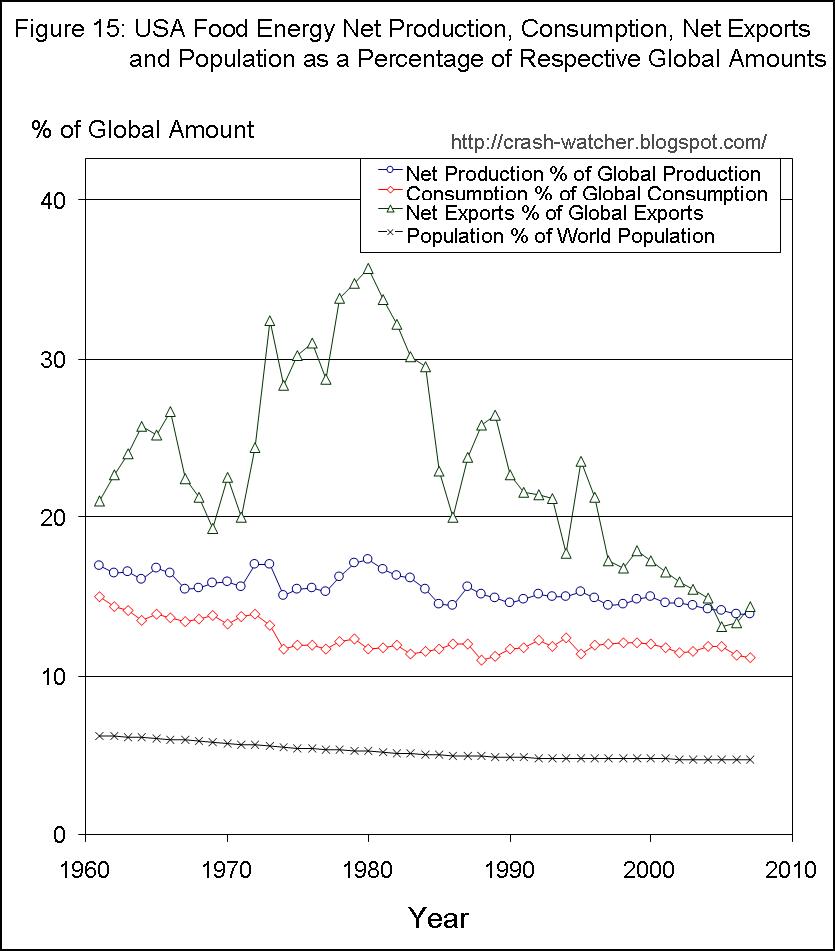
The USA's population (black line, Figure 15) in 2007 was 4.7 percent of the world's population—this is down from 6.2 percent in 1961. The declining percentage reflects the fact that, during this time period the world's population has grown faster than the USA's population growth.
During this period, the USA's domestic consumption of food energy (Figure 15, red line) has gone from 15 to 11 percent of the worlds total food energy consumption. In other words, the USA's population of 6.2 to 4.7 percent of the world consumed more than double, 15 to 11percent, of the food energy that was consumed by the world. There a declining trend in the proportion of the USA's consumption, but this is not due to an absolute decrease in the USA's consumption, which continues to increase (Figure 9 red line). Rather, the declining proportion reflects the fact that global food energy consumption is increasing at a faster rate that the USA's rate of increase in consumption.
There is a similar trend for the USA's net food energy production (Figure 15, blue line) when expressed as a percentage of global production. The USA's net food energy production has gone from 17 to 14 percent of global food energy production. Once again the declining trend in the proportion of the USA's production is not due to an absolute decrease in the production, which continued to increase (Figure 9 blue line), but rather, the fact the global food energy production is increasing at a faster rate than the USA's 2 percent/yr rate of increase in food production. This makes sense, because the growth in global food production has had to at least keep pace with global population growth. As I showed in the previous post from 1961 to 2007, global food energy production/consumption (2.4 percent/yr) actually out-striped global population growth (1.7 percent/yr).
Still, the USA
The USA USA
In think that the declining importance to world exports reflects two trends. First is the trend for the USA
Components of USA
Figure 16 shows the major categories of the USA

For reference, total domestic consumption (red line “% global domestic supply”) is the same as the red line presented in Figure 15 and I also show the population as percentage of global population (black line).
As illustrated, all of the components of US food energy consumption are higher in proportion than the USA
For instance, in 2007 the USA
The proportion of processed, or manufactured food, is even higher at about 18 % of world processed food energy consumption. The highest proportion of all, however, is feed energy consumption at 20% of world feed consumption. This figure is down from 33% of world feed consumption in 1961 and has been fairly stable at 20% of world feed consumption since the mid 1970s.
Feed energy consumption reflects the food energy that goes into feeding livestock to support animal food production.
This is nicely illustrated in Figure 17, which shows the USA

For reference, the percentages of the total human food supply (same as the pink line presented in Figure 16), and the USA
Since the mid-70s, the proportion of plant-derived human food energy has been about 6% of world plant-derived human food energy, which is slightly higher than the USA
But it is the proportion of animal-derived human food supply in the USA USA USA
----------------------
In the third and final part of this series, I will give my summary and conclusions. See you then.
Very informative Energy Analysis in USA
ReplyDelete