Wednesday, September 19, 2012

Predicting Global and Regional Petroleum Consumption Trends Part 3: The Former Soviet Union

This continues the series of PIE (Production, Imports and Exports) analysis to predict future petroleum consumption, this time, for The Former Soviet Union (FS).  For background, see Part 1 and for a more detailed walk-through of how the analysis is done, see Part 2. 

Figure 6 presents the reported production, consumption and net exports rates (dark blue, bright red and dark green open circles respectively) and the corresponding nonlinear least squares analysis (NLLS) best curves (solid lines with the same respective colors ). 

 Similar to the ME, reported production rate data for the FS shows two separate peaks in production, and I modeled this data with two separate logistic equation NLLS fits to the 1965-97 time span and to the 1998-2011 time span.  The consumption rate data in the FS are similarly bimodally distributed, and therefore, I also modeled these data with two separate logistic equation NLLS fits to the 1965-97 time span and to the 1998-2011 time span.

The best fit parameters of Qo, Q and the rate constant, "a," from these logistic equation fits are summarized in Table 3 below:

Table 3 summary of best fit parameter for production and consumption for FS

Qo (bbs)
Q (bbs)
a (yr-1)
Production 1965-1997
14
151
0.12
Production 1998-2011
20
143
0.14
Consumption 1965-1997
9.0
102
0.12
Consumption 1998-2011
117
1007
0.012


Although NLLS best fit to the production data 1998-2011 time span is fairly similar to analysis to my earlier ELM analysis for the FS in Estimating the End of Global Petroleum Exports, the NLLS best fit to the consumption data is quite different.  The best fit to the consumption data for the 1998-2011 time span (red line), suggests a several times larger ultimately recoverable reserve (Q) than in “Estimating the End.”  This is due to the continuing up-tick in FS’s consumption rates for the past two years.  The NLLS best fit looks more like a linear regression line but that is what the data trend is suggesting, and so, I am bound to go with this trend. 

A consequence of this higher rate of consumption is that “net exports” (again defined here as total production rate minus total consumption rate) hits zero in 2027; that’s a full six years earlier than what was predicted in “Estimating the End.” 

What does my PIE analysis do with the data for FS?  As you will see almost the opposite trends are obtained.

I am going to go through this much faster than I did for ME, especially the steps that are about the same as described in detail in Part 2.

Predicting Export Rates from FS to other Regions
Figure 7 shows the relationship between petroleum production rates and export rates for the FS, as already worked out in my previous study from last month ago.   This is actual the same as Figure 7 in Part 2 the “Relationship between Petroleum Exports and Production.”

Unlike ME, whose total export rates are trending downwards, FS’s total export rates relative to its total production rate are on a strong upward trend (black Xs and line, r2=0.80).  And, except for exports to SA and "UN" all of the other regions that receive exports (not ME, of course) are receiving ever-increasing proportions of FS production in the form of exports. 

Figure 8 shows predicted regional asolute exports from FS to the other regions, based upon combining the production rate trends shown in Figure 6 with the export trend lines shown in Figure 7.

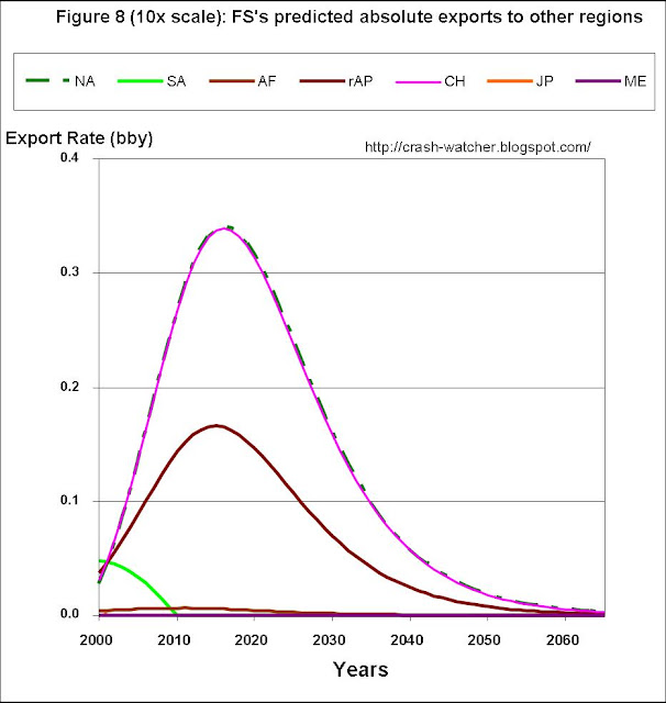
The most striking aspect to this plot is that it illustrate the huge proportions of the FS’s total exports (black line) that go to EU (blue line) as compared to any other region.  I suppose that one could look at this is two ways: EU is highly dependent on imports from the FS’s, or, FS is highly dependent on EU as an export destination.  Perhaps both are true.  As suggested by the trend lines in FIG. 7, FS's exports have been shifting towards NA, CH, JP and rAP, but these are much smaller amounts.  In fact to really see these trends, you have to expand the vertical scale 10 times:

In these figures I presented NA as a dashed line so that the export trends for NA and CH were both discernable.  It is interesting that these two regions are on virtually identical trend lines (oh, yes, I did indeed double check the results).  But these exports peak around 2016 and go down afterwards because by then FS’s production rates are in serious decline (FIG. 6, blue line).    Consequently FS never becomes a major petroleum supplier to the Asian regions (CH, rAP, JP) or NA.   

Some readers might wonder: what happen to EU as the FS’s exports go into decline? But I think one might equally winder: what happens to FS if it stays on its trend of ever-increasing exports as a fraction of total production?   

I will address this in a minute—but first there are some housing-keeping chores to take care of.  

Predicting Import Rates to FS from other Regions
Again, like ME, this is a non-issue—FS’s imports from individual other regions are so small that the BP review doesn’t report it.  

Predicting Consumption Rates for FS based on the PIE analysis
I am not going to repeat the whole issue about normalizing the predicted consumption and NET exports (which again like ME correspons to absolute exports, since FS has substantially no imports) based upon a comparison of reported consumption rate versus the consumption calculated from PIE for the time range (2000 to 2011) where I have actual data.  Briefly, for FS, the calculated consumption rate is 0.251 ± 0.123 bby higher than the reported consumption rate.  This is in contrast to ME where the calculated consumption rate was 0.403 ± 0.168 lower than the reported consumption rate.  Therefore my normalization for FS consisted of subtracting 0.251 bby from the calculated prodution rate, and, adjusting total net export rate upwards by this same amount—this in turn implies that the individual absolute exports to each of the other regions should be adjusted upwards proportionally so as to sum up to the adjusted total export rate amount.

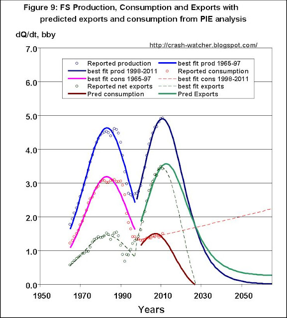
Alright then, Figure 9 again shows the production, consumption and net export data, and corresponding best fit curves, the later two curves now shown as dashed lines.  Added is the predicted export (light green solid line) and consumption (blood red solid line) prediction curves based on my PIE analysis. 


Figure 9 shows that, if FS’s production rate follows the logistic equation best fit (solid blue line), and the ever-increasing export rate trend continues along the lines shown in Figures 7 and 8, then the predicted total export rate curve (solid green line) is extended well past 2027 (dashed green line). 

The consequence of this however would be quite devastating for FS—now consumption drops to zero in 2027!  This is partly due to my normalization factor of -0.251 being applied to the consumption data—but even without normalization consumption goes to zero in 2038.  

This looks like the opposite of what the ELM analysis suggests in Figure 6. Now instead of unfettered increasing domestic consumption until hitting the production wall as suggested by the ELM analysis, the PIE analysis in Figure 9 suggests decreased consumption rates in order to sustain exports, until export hit the production rate wall.  The reason why the PIE analysis suggests this is due to the export trends revealed by the analysis supporting Figure 7. 

It is not realistic to think that FS would be able continue exporting at its present ever-increasing rate, even those that is what the trend line (black line, r2=0.8) in Figure 7 suggests. But at what point does would the present export trend end?  

I have some ideas about this, and, I will address this issue later on in the series, after completing the initial survey of all nine regions.  

For now, except for one adjustment, let’s just go with what the data trends are and see where this leads us. Consider this an upper boundary scenario, corresponding to the maximum that FS could possibly export, given its predicted production rate and current export trends.  

The one adjustment that I do want to make is analogous to the adjustment I made for ME.  In the context of Figures 4 in Part 2, I noted that ME’s consumption rates, predicted from the PIE analysis, actually exceeded production in about 2056.  This is unrealistic because ME substantiallydoesn’t import  any petroleum.  Therefore I adjusted ME’s petroleum consumption rate to match its production rate from 2056 and on.  

Here, for FS as illustrated in Figure 9, it is the export rate that exceeds the production rate in 2027.

Again this is unrealistic because FS substantially doesn’t import any petroleum.  Therefore I adjusted FS’s petroleum export rate to match its production rate from 2027 and on.  The result of this adjustment is presented in Figure 10.

Specifically, here’s how those exports to the other eight regions, previously presented in Figure 8, now look like, with the restriction that FS’s total export rate can’t exceed its production rate.  

As Compared to Figure 8, you can see that after 2027, exports to the other regions tail off more steeply, to match the rate of decline in the production rate.   

Of course, this doesn’t do anything to the prediction that FS’s consumption rates hit zero in 2027. 

But, having a more realist export rate prediction for FS is very important for subsequent PIE analysis for the other regions, because many of those other regions depend upon FS for imports.  
---------------------------------
Next time, in October, I will be back to present the PIE analysis of predicted consumption for Africa.

Sunday, September 16, 2012

Predicting Global and Regional Petroleum Consumption Trends Part 2: The Middle East

Continuing on from the concepts presented in Part 1, this post presents my PIE (Production, Imports and Exports) analysis to predict future petroleum consumption for The Middle East (ME).

Analysis of Production Consumption and Net Export Rates
As pointed out in Part 1, using my PIE analysis, I don’t need or use the consumption rate, or the net Export rate, data to estimate to predict future petroleum consumption rates.   Nevertheless, these data and their best-fit curves are interesting for comparison purposes because they would correspond to the inputs for my previous ELM analysis in Estimating the End of Global Petroleum Exports. 

Comparing the consumption and net export rates predicted from an extrapolation of the current consumption trend, to consumption predicted from the present PIE analysis is interesting because it my suggests to what extent regions could expect future “surprise deviations” from their current consumption trend.


Figure 1 presents the reported production, consumption and net exports rates (dark blue, bright red and dark green open circles respectively) and the corresponding nonlinear least squares analysis (NLLS) best curves (solid lines with the same respective colors ).  For more details on the NLLS fitting process I refer you to my earlier post Refining the peak oil rosy scenario.

The reported production rate date shows two separate peaks in production, first in 1977 (8.2 bbs/yr), and then again at present (9-10 bbs/ys).  To model this, I separately fit two logistic (aka Hubbert) equations to the 1965-84 time span and to the 1985-2011 time span.  In contrast, consumption rates in the ME are well modeled using a single logistic equation fit to the entire 1965-2011 time span.  “Net exports” is calculated as production minus consumption difference (both the reported data and the NLLS best fit curves).

The best fit parameters of Qo, Q and the rate constant, "a," from these logistic equation fits are summarized in Table 1 below:

Table 1 summary of best fit parameter for production and consumption for ME

Qo (bbs)
Q∞ (bbs)
a (yr-1)
Production 1965-84
11
149
0.219
Production 1985-2011
74
520
0.072
Consumption 1965-2011
7
365
0.053

In particular, notice how the extrapolated best fit to reported consumption rate (red line) intersects with the best fit to predicted production (blue line) in about 2033-2034, concomitant with dark green line of net exports going to zero in about 2033.  These curves imply that ME would have to become a net importer of petroleum in about 2033. This is actually about three years earlier than what my ELM analysis for ME from Estimating the End of Global Petroleum Exports about 1½ years ago had predicted, mainly because the extrapolated best fit to reported consumption rate is ascending even faster than before.  Finally, notice how the extrapolated best fit to reported consumption rate (red line) predicts consumption peaking at about 4.8 bby is about 2040. 

Co-incidentally I note that a recent Citigroup analysis has suggested that the Kingdom of Saudi Arabia could become a net importer of petroleum by 2030.  Of course, as goes KSA so to goes the ME, so perhaps such an agreement is not too surprising.  But then, I wonder, where in 2033 would KSA or ME be importing its petroleum from?  And what would replace the lost income from the petroleum that was formerly being exported from KSA or ME to other regions?  And, what would happen to those other regions that a highly dependent on petroluem imports from the ME?  Is this really the most realistic scenario?  Or, can the available data support a more realistic scenario? 

Well, I think that it can.  Let’s see how my PIE analysis agrees or disagrees with the prediction trends outlined above.

Predicting Export Rates from ME to other Regions
Since this is the first detailed PIE analysis for the nine regions of the series I will report a bit more of the nuances of the analysis than I plan to do in future parts of the series. 

As I pointed out in Part 1, in Relationship between Petroleum Exports and Production I generated a trend analysis for each of the nine regions relating exports from that region to the other eight regions, expressed as a percentage production.  Figure 2 shows this trend analysis for the ME; this was originally presented as Figure 6 in part 2 of that earlier series.  Notice that the trend line starts in 2000, because this is the first year for which I have inter-area petroleum movement data from the yearly published BP reviews.

As you can see, and as already discussed in the previous series, ME’s overall exports (black line and Xs), expressed as a percentage of it’s production, is strongly declining, at about -0.92 percent per year (r2 = 0.86).  But, not all exports to all regions are trending downwards.  Exports to NA, EU, JP, AF and SA are trending downwards and these all reach zero by 2030 or earlier.  In contrast, exports to CH and rAP are trending upwards.  Eventually, however, to maintain the overall downward trend in exports (black line), exports to CH and rAP as a percentage of production, have to decline—but this is not until the late 2020s or early 2030s, when according to Figure 1, ME’s petroleum production rate will be in decline. 

Now, using the predicted production rate for ME (the blue line based on the best fit NLLS analysis shown in Figure 1), and the relationship between exports and production (trend lines presented in Figure 2), we can predict ME’s future exports to the other eight regions.  This is presented in Figure 3 below.  Again, notice that these curves start at 2000. 

According to this export scenario, ME’s total absolute exports are presently at or slightly past peak, and the rate of exports will decline until reaching zero in the mid 2050s.  As expected from Figure 2, absolute exports to NA, EU, JP, AF and SA are in decline, and, absolute exports to rAP and CH continue to increase until 2012-2013 and 2022, respectively.  By far, rAP is the largest beneficiary of ME’s exports.  Figure 3 also shows the increase in exports to from ME to CH quite clearly: exceeding AF in 2001, NA in 2009, EU in 2010 and JP in 2015. 

Predicting Import Rates to ME from other Regions
Well, this is an easy one for ME: a big fat zero.  Specifically, the inter-area petroleum movements data from the BP review doesn’t report any significant exports from any of the other eight regions to ME, and therefore, the regional import curves that would be the counter-part of Figure 3 are all flat lines. 

Predicting Consumption Rates for ME based on the PIE analysis—normalizing expectations
As I pointed out in Part 1 of this series, my base assumption is that the petroleum consumption rate for a region is equal to (or at least proportional to) the sum of the region’s production rate plus it’s total import rate minus it’s total export rate.  Here, for ME, since imports from the other eight regions to ME are substantially zero, ME’s predicted consumption rate is just production minus total exports. 

We can actually check my base assumption by comparing the reported consumption rate for the years 2000 to 2011 to calculated consumption rate, calculated here as ME’s production rate minus ME’s total exports as derived from the BP review’s inter-area petroleum movements data reported for each of these years.  Table 2 below shows these data and also calculates the difference (reported minus calculated) and average difference ± standard deviation. 

Table 2: comparison of reported and calculated petroleum consumption rates and differences
Year
Reported consumption rate (bby)
Calculated consumption rate (bby)
Difference
2000
1.866
1.671
0.194
2001
1.920
1.437
0.483
2002
1.995
1.332
0.664
2003
2.083
1.567
0.516
2004
2.226
1.922
0.305
2005
2.323
2.033
0.290
2006
2.415
1.972
0.442
2007
2.517
2.022
0.495
2008
2.654
2.260
0.393
2009
2.741
2.266
0.476
2010
2.880
2.347
0.533
2011
2.948
2.898
0.050


Average ± SD
0.403 ± 0.169


Although the calculated consumption rate follows the same trend as the reported consumption, it is apparent that there is a systematic difference between the absolute values.  On average, the calculated consumption rate is 0.403 ± 0.168 lower than the reported consumption rate. 

There are a few possible explanations for this systematic difference.  First, as I noted in “Estimating the End” part 5, for the last 30 years, the BP review has reported a total world petroleum production rates that are systematically lower, by about 1-1.5 bbs/yr, than the reported total world consumption rates.  Since I am comparing reported consumption for the ME to a calculated consumption, that is based in part on the reported production rate, one shouldn’t be too surprised to see a systematic difference between the reported and calculated consumption which gets carried through to the regional level.  Second, as I noted in Part 6 of Inter-Regional Trade Movements of Petroleum the inter-area petroleum movements data presented in the BP review includes an regional category, “unidentified,” which apparently includes “changes in the quantity of oil in transit, movements not otherwise shown, unidentified military use etc.”   In general, the amounts in “unidentified,” are small, maybe corresponding to about 1 percent of total global export pool—but still it could be a factor.  For instance, it is possible that some portion of this could “unidentified” petroleum could be consumed in ME, but, I would have no way of accounting for it. Third, I know from my analysis in Inter-Regional Trade Movements, Part 7, that ME does have some imports on the order of 0.1 bby.  But because source(s) of the imports is not reported in the BP review’s yearly reports of petroleum inter-area movements I can not account for this.  Including 0.1 bby in imports would make the difference between the reported and calculated consumption rates smaller, but there would still be a discrepancy of about 0.3 bby present.  Fourth, it is possible that some of the ME’s consumption is from consuming pre-existing reserves of petroleum that were produced in other years but are being consumed now.  I could see how consuming reserves could cause a discrepancy for one or two years between reported consumption and my PIE analysis predicted consumption (which is based on yearly production plus imports and minus exports).  But it is harder to imagine this explaining a systematic long-term difference.  Still, I can’t discount this as a factor also.

Whatever the reason(s), I still have to deal with this discrepancy. 

The way I have decided to deal with it is to normalize the predicted NET export rate (which for ME just equals the predicted export rate since there are substantially no imports), such that the calculated consumption rate equals the reported consumption rate over the time range of 2000 to 2011.  For ME this seemed reasonable since otherwise total absolute exports doesn't match the net export rate very well (Figure 4B below).  Consequently, for ME, I have adjusted the individual regional predicted absolute export rates proportionally, such that the total predicted absolute export rate is 0.403 bby less than would be predicted by simply multiplying production rate by the trends discovered in Relationship between Petroleum Exports and Production. 

In fact, these normalized export rates are what is presented in Figure 3.  The shapes and trends of the “non-normalized” predicted export and consumption exports look the same except that exports are shifted slightly higher (i.e., on average 0.403 bby higher in the range 2000 to 2011) and consumption is shifted lower by this same amount.  

Consequently, the average difference in predicted consumption rates for the time range 2000 to 2011 is 0.403 higher (since consumption is calculated as production minus exports), and therefore, the average difference between predicted and reported consumption over this time range equals zero. 

Okay, with the normalization issue dealt with, what does ME’s petroleum consumption tread look like?  Figure 4 reproduces the production, consumption and net export data, and corresponding best fit curves.  The best fit curves for consumption and net export are now shown as dashed lines and newly added are the predicted export (light green solid line) and consumption (blood red solid line) prediction curves based on my PIE analysis. 

By way of comparison, Figure 4B shows what these export and consumption curves would look like without the normalization applied. 


Turning back to Figure 4, what this figure is saying is: if the production rate follows the logistic equation best fit to the reported production data (Figures solid blue line), and the export rate trend continues along the lines shown in Figures 2 and 3, then the predicted total export rate curve (solid green line) is extended out to the mid 2050s, instead of ending in 2033 (dashed green line from ELM analysis). 

To accomplish this however, the consumption rate (solid red line) from the PIE analysis predicts a much lower rate, than say, the  consumption rate predicted by extrapolating the best-fit curve to the reported consumption rate data (dashed red line from ELM analysis).    Specifically, the consumption rate according to the PIE analysis is predicted to peak in about 2020 at about 3.25 bby, which is about 10 percent higher than the reported consumption rate of 2.95 bby for 2011.  This is a far cry from a consumption rate of 4.8 bby as suggested by the extrapolated best fit to the reported consumption rate data (dashed red line)

It is pretty obvious what such a scenario would gain for the ME: roughly 20 years of continuing petroleum consumption at, or slightly higher, than the present rate, PLUS continued revenue from exports until the mid 2050s, albeit at diminishing rates, but at least extending well beyond 2033. 

There is one more aspect to the predicted consumption rate curve shown in Figure 4 that I think needs adjusting.  As I already discussed, the predicted exports go to zero in the mid 2050s.  The predicted consumption rate in Figure 4 suggest that in 2056 the consumption rate would exceed the ME’s production rate and therefore the ME would have to become a petroleum importer.  This is probably due, at least in part, to the normalization that was applied to the predicted export and consumption curves.  But, even if this is an accurate prediction trend, I doubt that it would happen.  As will become apparent from the subsequent parts of this series, by the mid 2050s, petroleum exports will be in short supply, and therefore, it is difficult to see how, starting in the mid 2050, a region with continuing domestic production, like the ME, would be able start to import significant quantities of petroleum.

Rather, I think that by 2056, the ME’s consumption rate would simply adjust down to the region’s domestic production rate (blue line), such as presented in Figure 5. 

As you can see, after 2056, the declining consumption rate would adjust down to a little bit faster decline rate.  But, this would not be nearly as dramatic a transition, as say, the consumption rate continuing along the path shown by the red line in Figure 1, until 2033 and thereafter sharply declining to follow the production rate curve along it’s downwards path. 
------------------------------
Next time, I will present my PIE analysis of the world’s second biggest petroleum producing and exporting region—the former Soviet Union.