In this, and my next post, I draw on the analysis done in my previous multi-part series, Inter-Regional Trade Movements of Petroleum, to examine the relationship between petroleum exports and production.
Although the present analysis is interesting in its own right, I do have an ulterior motive. My main motivation is using the results here to predict regional export amounts as part of improved analysis, over my previous effort, to predict future regional petroleum consumption patterns, and its implications for these regions.
As part of my Inter-Regional Trade Movements of Petroleum series reorganized into nine regions, the last decade’s worth petroleum production and export data reported in Statistical Review of World Energy” (hereinafter, BP review), and a lesser extent in the USA’s Energy Information Agency’s International Energy Statistics. Since finishing Inter-Regional Trade Movements of Petroleum, BP has come out with its 2012 BP review which reports statistics from 2011. The present analysis includes the se data. Additionally unlike the 2011 BP review, the 2012 BP review includes biofuels production back to 1990. I included this as part of my calculation of total petroleum production for each of the regions.
My nine regions are defined as:
1) North America (NA): US (excluding Puerto Rico), Canada and Mexico
2) South America (SA): Caribbean (including Puerto Rico), Central and South America
3) Europe (EU): European OECD members (Austria, Belgium, Czech Republic, Denmark, Finland, France, Germany, Greece, Hungary, Iceland, Republic of Ireland, Italy, Luxembourg, Netherlands, Norway, Poland, Portugal, Slovakia, Slovenia, Spain, Sweden, Switzerland, Turkey, United Kingdom) PLUS Albania, Bosnia-Herzegovina, Bulgaria, Croatia, Cyprus, Former Yugoslav Republic of Macedonia, Gibraltar, Malta, Romania, Serbia and Montengro, Slovenia.
4) The former Soviet Union (FS): Armenia , Azerbaijan , Belarus , Estonia , Georgia , Kazakhstan , Kyrgyzstan , Latvia , Lithuania , Moldova , Russian Federation , Tajikistan , Turkmenistan , Ukraine , Uzbekistan
5) Middle East (ME): Arabian Peninsula , Iran , Iraq , Israel , Jordan , Lebanon , Syria
6) Africa (AF): Territories on the north coast of Africa from Egypt to Western Sahara . Territories on the west coast of Africa from Mauritania to Angola , including Cape Verde , Chad Sudan to Republic of South Africa Botswana , Madagascar , Malawi , Namibia , Uganda , Zambia , Zimbabwe
7) China
8) Japan (JP)
9) The remaining Asia-Pacific (rAP): Brunei, Cambodia, China, China Hong Kong SAR*, Indonesia, Japan, Laos, Malaysia, Mongolia, North Korea, Philippines, Singapore, South Asia (Afghanistan, Bangladesh, India, Myanmar, Nepal, Pakistan and Sri Lanka), South Korea, Taiwan, Thailand, Vietnam, Australia, New Zealand, Papua New Guinea and Oceania) minus China and Japan.
In the charts to follow, for each of these nine regions, I preformed a linear regression analysis of the annual quantity of petroleum exports (in units of barrels per year, bpy) to each of the other eight regions, versus total petroleum production (also in units barrels per year, bpy) for the exporting region in interest.
My premises for predicting future export quantities
1) My primary premise is fairly straight-forward: amounts of petroleum exports from a region should be directly relates to the total amount of petroleum being produced in that region. Of course, the specific relationship between exports and production differ substantially from one region to the next. For instance, one might expect that a net petroleum exporter to export a much larger fraction of its total production than a net petroleum importer. Generally this is true, although there are exceptions (see e.g., Europe and Japan
2) My secondary premise is that once I know what the relationship between production and exports
has been, this relationship or trend will continue. More specifically, I assume that the last decade’s trend in this relationship (as estimated by the slope and intercept of regression lines) will carry on going forwards.
If these two premises are correct, then, by predicting future petroleum production rates for a region (e.g., based on a Hubbert Equation analysis of past production rates) I can predict exports from that region to all of the other eight regions. And, by predicting regional production and exports, I can predict petroleum consumption for every region.
But, let’s not get too far ahead of ourselves—on to the analysis at hand.
The colored symbols in Figure 1 show plots of petroleum exports from NA to each of the other eight regions, expressed as a percentage of total petroleum production in NA for the particular year for which I have both export and production data (i.e., from the year 2000 to 2011). The corresponding colored solid lines represent the best fit linear regression line for each of the eight regions, , as scaled using the vertical axis on the left hand side. The black symbols (Xs) and black solid line correspond to total exports expressed as a percentage of total petroleum production in NA, as scaled using the vertical axis on the right hand side.

As you can also see the main destination for NA increasing proportion of exports is South American (SA, green line r2 = 0.92) with Europe (EU, blue line r2 = 0.56) next. In fact, exports as percentage of production is up for all six regions that NA exports to—that include the remaining Asia-Pacific region (rAP, r2 = 0.46), China (CH, r2 = 0.58) and even Africa (AF, r2 = 0.86). The only two regions that NA doesn’t export to (or more correctly the BP review doesn’t shown data for)—are the Middle East (ME) and former Soviet Union (FS).
The plots shown in Figure 2 are completely analogous to that showed in Figure 1: the colored symbols and linear regression lines correspond to the yearly exports as a percentage of production to each of the other eight regions, and the black Xs and line shows the same for total exports.
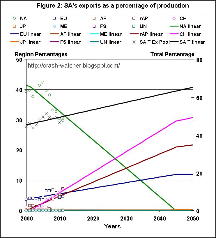
As the black Xs and regression line indicate, the over all trend is for exports as a percentage of production to increase, about 0.4 percent per year, which less than the rate of exports increase for NA. But, SA’s increase is the combination of falling exports to NA (-0.94 percent per year), and increasing imports to China (CH, +0.68 percent per year) and the remaining Asia-Pacific (rAP, +0.46 percent per year), with a smaller increase to Europe (EU, +0.18 percent per year).
One could look at this as SA shifting its main export destination away from NA and toward CH and rAP. If this trend continues then exports to NA will drop to zero by 2044.
This presents a problem for using these linear regression lines future exports as percentage of production beyond 2044—negative reports to NA do not make sense, but if I set the subsequent yearly exports equal to zero, then the percentages to the other regions don’t add up to 100 percent. To deal with this I decided to normalize the percentages with respect to the solid black line shown in the figure. As I mentioned above, the solid black line corresponds to the linear regression prediction line of yearly total exports as a percentage of total production. Normalizing with respect to this line after 2044 is reflected by the decreased slopes in the solid lines for CH, rAP and EU. Think of it this way: now that the negative slope for NA is no longer contributing to the total (the black line) the rates of increasing slopes for CH, rAP and EU, and the remaining regions, must all proportionally decrease in order to add up the predicted total exports.
There is a similar smaller problem for CH in the years 2000 and 2001. For both of these years, regression line predicted negative export values from SA, which of course does not make sense (this is not the same as say positive exports from CH—CH has its own export analysis). So I applied the same principle to normalize the export data proportionally for the remaining seven regions. This mainly affects NA, EU and rAP, which receive significant exports from SA, and, in the figure you can see this as a slight flattening for NA in the years 2000 and 2001 so that the sum of exports in the remaining seven equals the solid black line for these years.
let’s do one more region today
Once again the plots in Figure 3 are completely analogous to that shown in Figures 1 and 2.

EU’s exports as a percentage of production are up for several regions. The rate of increase in EU’s exports to NA and JP is pretty slight. For AF, rAP, SA and Unidentified (UN) the rate of increase is more prominent. “Unidentified,” as the BP review puts it, is: “changes in the quantity of oil in transit, movements not otherwise shown, unidentified military use etc...” In 2011, there is a huge increase in EU’s exports to AF—I suspect that this reflects the large decrease in petroleum production in Libya
Most striking here is Europe ’s overall very strong trend for increasing total exports as a percent of production. Expressed as a percentage of production—total exports are increasing at 1.7 percent per year (black Xs and solid black line r2 0.88). For instance, in 2000, exports corresponded to 28 percent of total production—but by 2011 that number was up to 51 percent.
Over 50 percent—are you sure? Well, you can see this yourself in the 2012 BP review Europe’s production (that is, Eurasia minus the Former Soviet Union) equals 4021 tbd (i.e., petroleum production of 17314 minus 13487, plus biofuels production of 198 minus 4) but its total exports (from the “Oil: Inter-area movements 2011” worksheet; or the “Oil: Imports and exports 2011” worksheet) equals 2065 tbd. That export total is corresponds to 51 percent of total petroleum production—which is what is depicted in the Figure (black X, square for 2011).
At least in part the reason for this increase is due to EU’s decrease in production (e.g. see Figure 2, solid blue squares of Part 6 of my previous series), but, there is also another trend going on.
In 2011, the bulk (87%, from the “Oil: Imports and exports 2011” worksheet) of EU’s petroleum exports were product exports. For instance, according to the BP review, in 2011 EU exported 1805 tbd of petroleum products, and 259 tbd of crude oil—a product:crude export ratio of about 7:1 ratio. In contrast, the bulk of EU’s petroleum imports (77%) were crude oil imports.
Back in 2000, only 43% of EU’s exports were product exports (i.e., a product:crude export ratio of 0.74:1) but, the proportion of it’s imports as crude oil was about the same (80% in 2000). So, it seems that EU is finding increasing value by processing its own crude oil production and imports, and exporting at least a portion of this as petroleum products to other regions. In other words, EU’s role is increasingly a go-between, with the know-how and facilities to import crude oil, process it, and re-export the petroleum products.
That black trend line, extended to 2050, implies that EU’s petroleum exports as a percentage would actually exceed its own domestic petroleum production. This might seem odd, but it is not unprecedented—in fact, Japan
------------------------------------------------
8/11/2012 I revised text to explain where the production data from JP comes from; revised Figure 3 and corresponding text to actually include the data and regression analysis that includes the 2011 data (all that work to update the spreadsheets and then I don’t include it in the figure... sheeeh!)


